Form Building
Building Form
Build, design, and preview forms simultaneously — and export them effortlessly with our powerful, intuitive Form Builder.
The platform includes a flexible drag-and-drop builder that enables developers to dynamically generate forms and resources for their applications.
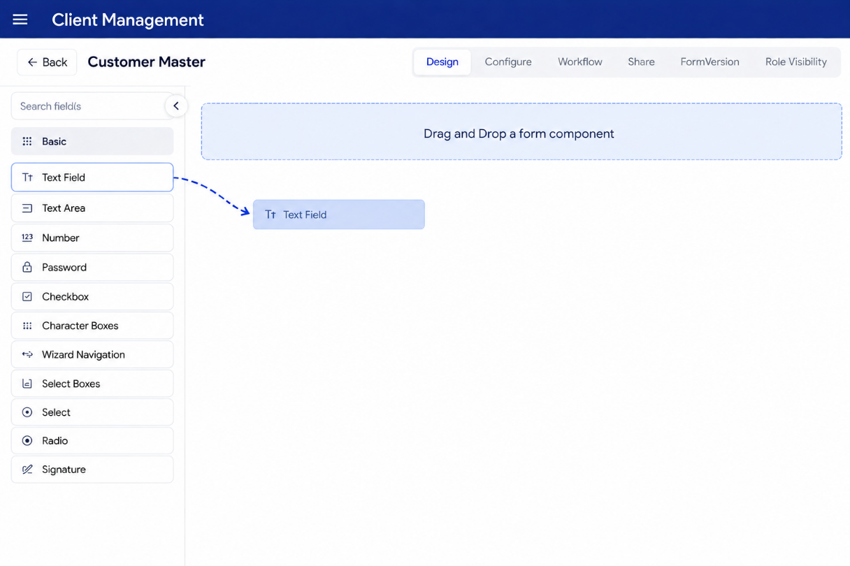
Adding a Form Component
To add a form component, simply drag it from the left panel and drop it into your desired position within the form
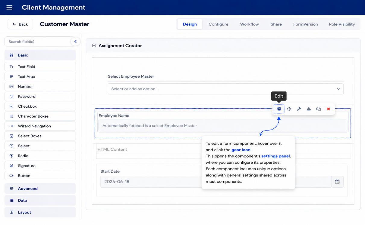
Configuring a Form Component
To edit a form component, hover over it and click the gear icon. This opens the component’s settings panel, where you can configure its properties. Each component includes unique options along with general settings shared across most components.
Form Creation Example
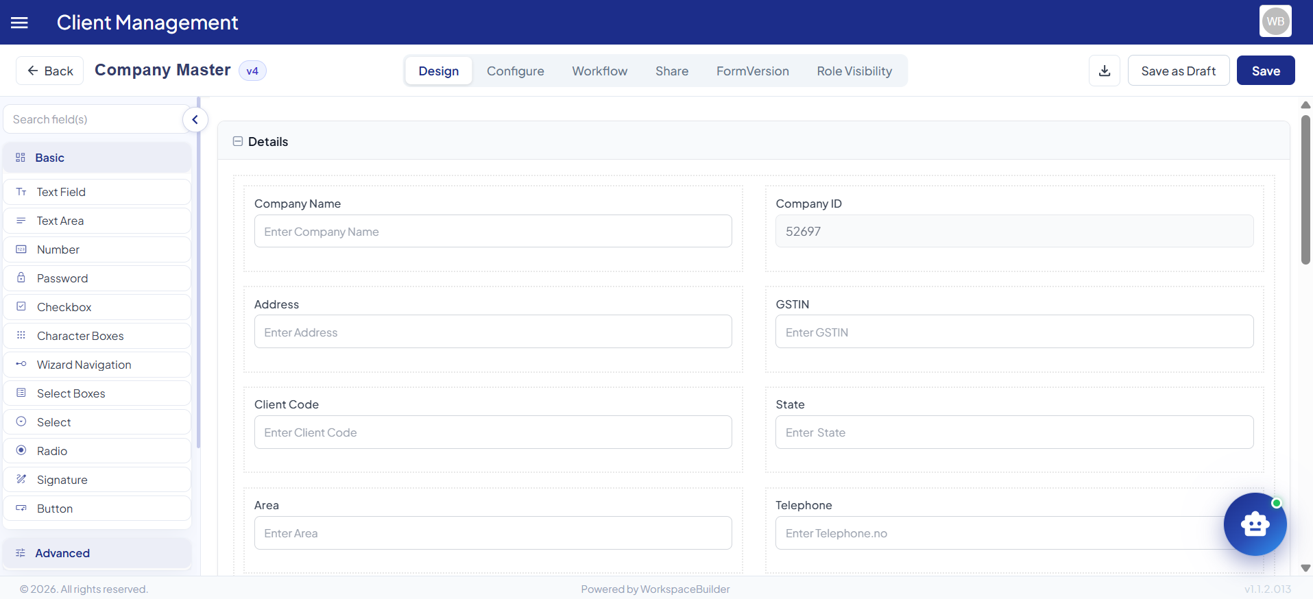
This example demonstrates how to create a simple User Registration Form using the Form Builder. The form includes basic fields such as First Name, Last Name, Email, and Phone Number. Each field can be easily added by dragging the corresponding component from the left panel into the form layout. After adding the fields, you can configure their properties — such as making Email a required field or validating the phone number format. Once completed, the form can be saved, previewed, and integrated into your application for collecting user information.
A Form component serves as the user interface for collecting data within the system. Each component defines the type of input widget users interact with, such as text fields, dropdowns, or checkboxes. When a component is added to a form, it automatically generates a corresponding property in the resource endpoint, enabling seamless data interaction. Components also include configurable settings, such as validation, default values, and display options, giving developers fine-grained control. Together, these features make the form builder a powerful tool for creating dynamic, data-driven applications.