PDF Forms
PDF-First forms enable users to upload an existing PDF and seamlessly add interactive overlay fields, transforming traditional static forms into modern, user-friendly digital experiences.
Creating PDF Forms Type
To create a PDF form in the app, follow these steps:
-
Click the Create Form button
- A list of form types will appear.
- Select the PDF Form option.
-
Enter Form Details
- Provide a name for your PDF form.
-
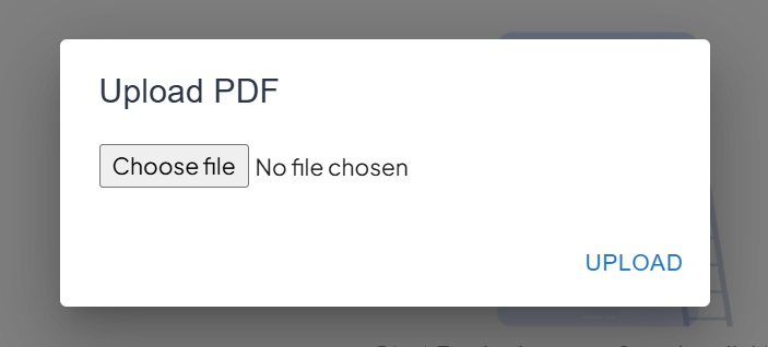
Upload the PDF
- After creating the form, you will be prompted to upload a PDF file.
- Select the PDF from your local machine.
-
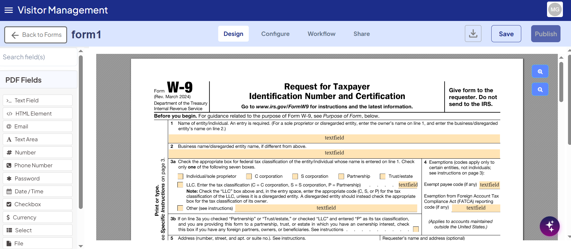
Automatic Field Detection
- The platform will automatically detect fields in the uploaded PDF.
- Detected fields will be displayed for review.
-
Add Overlay Components
- Drag and drop additional overlay components if required.
- Customize the PDF form with interactive elements.
-
Finalize the PDF Form
- The PDF form functions like any other form within the platform.
- You can incorporate it into staging, team workflows, and form versioning.
- The intuitive drag-and-drop interface makes it easy to manage.
Overlay PDF Components in PDF Forms
Within the PDF Form Builder, form builders have access to a wide range of overlay components.
Many of these components behave similarly to their counterparts in web forms, but some have been adjusted specifically for PDF contexts to ensure optimal placement, interaction, and display on static PDF pages.
The following points summarize component usage in PDF forms:
- Components behave like standard web form elements, with minor modifications tailored to PDFs.
- Changes apply only to PDF forms and do not affect web form submissions that are later downloaded as PDFs.
- For details on the standard behavior of each component, refer to the official documentation for that component.
Available Components
-
Text Field
-
HTML
-
Email
-
Text Area
-
Number
-
Phone Number
-
Password
-
Date & Time
-
Checkbox
-
Currency
-
Select
-
File
-
Signature
-
Overlay components can be dragged and positioned anywhere on the PDF to match the original document.
-
Validation and interactivity are preserved in PDF forms while maintaining compatibility with the static nature of the PDF.
To understand how these components behave specifically on PDF-First forms, see the section Component Behavior Unique to PDF Forms in this document.
Adding Overlay Components
To enhance your PDF Form, overlay components can be added using the drag-and-drop builder:
-
Drag and Drop
- Select a component from the available list and drag it onto the PDF.
- The position where you drop the component is the position it will be saved on the PDF form.
-
Component Identification
- Each overlay displays its component name (e.g., Text Field, Checkbox) within the overlay box.
- This helps form builders easily identify the type of component placed on the form.
-
Positioning Accuracy
- Ensure components are aligned correctly with the PDF content to maintain readability and proper functionality.
- Components can be repositioned or resized as needed before finalizing the form.
Positioning Overlay Components
After adding overlay components to your PDF form, you can adjust their placement and size for precise alignment:
-
Repositioning Components
- Click and drag the overlay field to move it to a new location on the PDF form.
- This ensures the component aligns correctly with the underlying PDF content.
-
Resizing Components
- Hover over the component to reveal the blue sizing box at the bottom-right corner of the overlay.
- Click and hold the sizing box, then drag to adjust the height and width of the component.
- Resizing preserves the component's position while allowing you to fit it neatly within the PDF layout.
-
Tips for Accurate Placement
- Zoom in on the PDF for finer adjustments.
- Use the drag-and-drop grid or guides (if available) to align multiple components consistently.
Component Behavior Unique to PDF Forms
Certain components behave differently in PDF forms compared to standard web forms. Understanding these differences ensures consistent design and functionality.
Input Fields
Input fields are components that end users interact with to enter data. These include:
- Text
- Text Area
- Number
- Phone Number
- Password
- Date/Time
Font Size and Field Height
- The vertical size of an input field determines the font size of the text entered by the user.
- To maintain uniform font size across all overlay fields:
- Adjust the PDF Overlay Height for each component to standardize text size and field height.
- Alternatively, use the PDF Font Size setting on the form to set a universal text size for all fields, independent of component height.
Proper use of these settings ensures consistency and readability across your PDF form fields.
Checkboxes and Radios in PDF Forms
Checkboxes and radio buttons are essential components for capturing selections on a PDF form. The PDF system uses a single Checkbox component to handle both standard checkboxes and radio (mutually exclusive) interfaces.
Checkbox
-
Purpose:
- A checkbox is typically used for a singular selection, such as an “I agree” statement for a yes/no answer.
-
Adding a Checkbox:
- Drag and drop the Checkbox component onto the PDF form.
- Resize it to match the checkbox outline on the PDF.
- By default, the label is hidden. Enter a Label name for display and set the API Key for the data saved by this checkbox.
- Adjust the position and size as necessary.
Radio Buttons
-
Purpose:
- Radio buttons allow mutually exclusive selections, such as choosing a marital status between “Married” or “Single.”
-
Creating a Radio Interface:
- Drag a Checkbox component onto the PDF for each radio option.
- In the edit modal, change the Input Type to Radio.
- Enter the Radio Key (the data field name, e.g.,
maritalStatus) and the Radio Value (e.g.,marriedorsingle). - Repeat for each option to create a mutually exclusive set.
Styling Checkboxes and Radios
The PDF viewer uses a system called Pretty Checkbox. You can customize the default blue square style by applying Custom CSS Classes to each component.
Shape Classes
| Class | Description |
|---|---|
p-round | Turns the square checkbox into a circle (ideal for radios) |
p-curve | Turns the square checkbox into a rounded square |
Fill Classes
| Class | Description |
|---|---|
p-fill | Fills the entire checkbox with the desired color |
p-thick | Creates a thick outline with a small center fill |
- Example Usage:
- Apply these classes in the Custom CSS Class field of the Checkbox component to achieve the desired shape and fill style.
Using these settings, checkboxes and radios can be styled to match the original PDF design, ensuring both functionality and visual consistency.