Form Builder UI
The Form Builder UI is the main workspace where you design, configure, automate, and publish every form in your project. You enter it by clicking Start Design on any form in Design Mode.
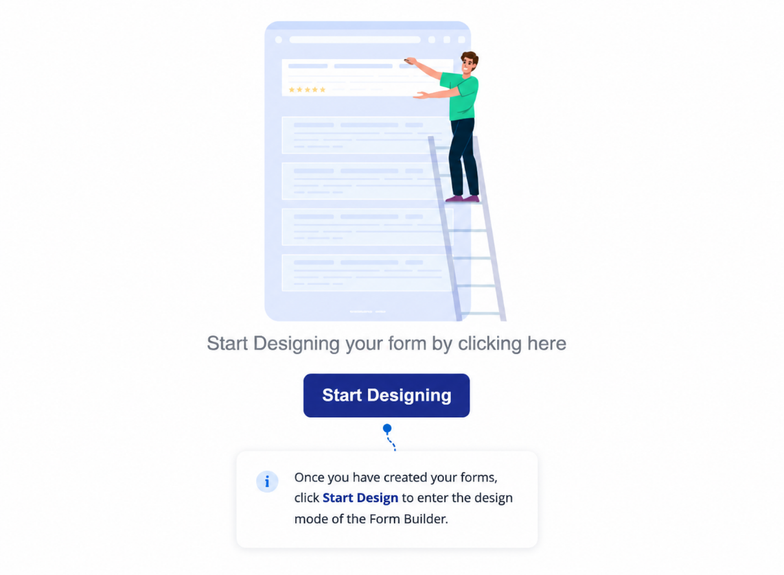
Once inside, the builder presents a canvas with a component palette on the left and a set of Form Studio mode tabs across the top. Together these tools take a form from blank canvas to live, deployed experience.
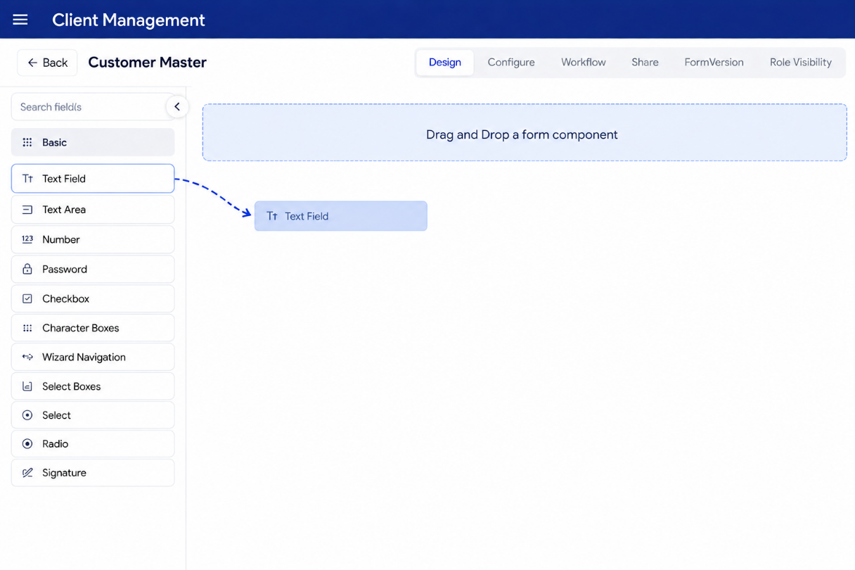
Builder Canvas — Key Controls
Before working with components, familiarize yourself with the core controls available at all times in the builder.
| Control | What it does |
|---|---|
| Search Field | Search the component palette by name to quickly find any component |
| Component Groups | Components are tabbed by type: Basic, Advanced, Data, Layout, Premium, Custom |
| Drop Zone | The white canvas area — drag components from the palette and drop them here |
| Save | Saves the current form state including all unsaved changes |
| Edit | Reopens a previously saved submission for modification |
→ Form Components Overview — full reference for every component group
Form Studio — The Six Modes
Form Studio sits at the top of the builder. It divides the form lifecycle into six focused modes. You move through these tabs to take a form from design to deployment.
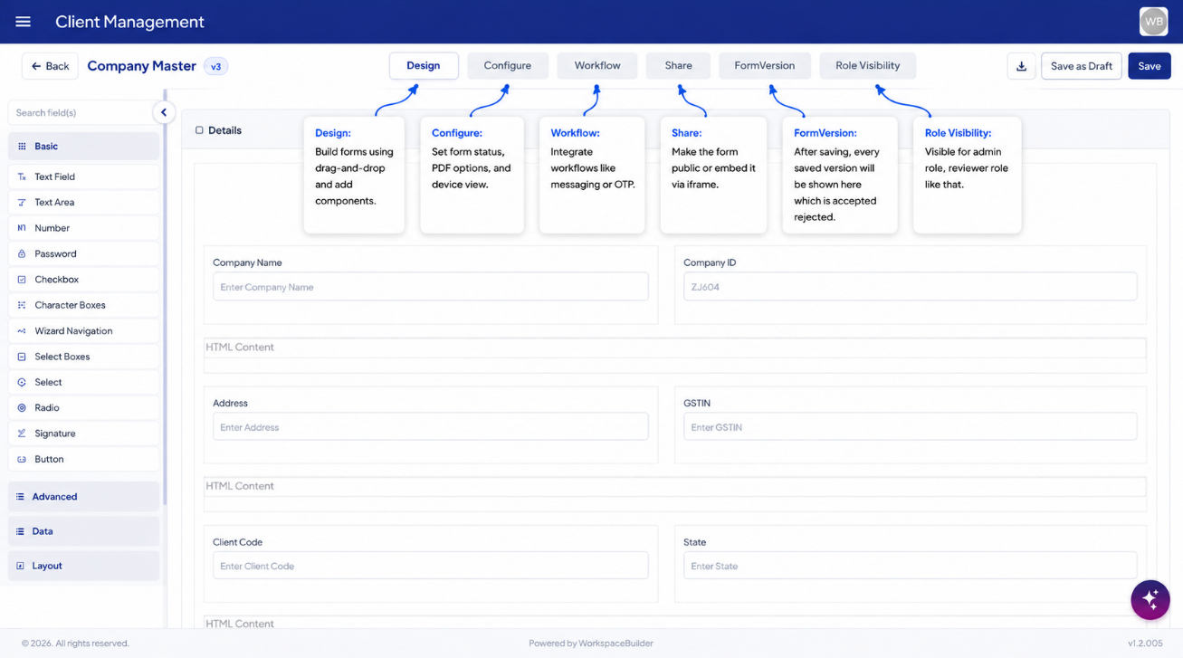
┌─────────────┬─────────────┬─────────────┬─────────────┬─────────────┬─────────────┐
│   Design    │  Configure  │  Workflow   │    Share    │  Versions   │    Role     │
│  (Build it) │ (Set it up) │(Automate it)│(Publish it) │ (Track it)  │ Visibility  │
└─────────────┴─────────────┴─────────────┴─────────────┴─────────────┴─────────────┘
| Mode | Purpose | Guide |
|---|---|---|
| Design | Drag-and-drop components onto the canvas to build the form structure | Design Tab |
| Configure | Set form status, attach PDF templates, restrict by device, and configure shared submissions | Configure Tab |
| Workflow | Create automation flows — emails, Slack messages, webhooks, and OTP triggers on submission | Workflow Tab |
| Share | Toggle public access, copy the form URL, and generate iframe or JavaScript embed codes | Share Tab |
| Versions | View the full version history of the form — preview or restore any past published version | Form Version History |
| Role Visibility | Control which roles can see each component — hide or show fields per user role | Role Visibility |
Full Form Builder Workflow
The tabs above are part of a larger end-to-end flow inside the Form Builder. Here is how everything connects.
Enter Form Builder (Start Design)
        │
        ▼
 ┌─── Design Tab ────────────────────────────────────────────────┐
 │  Drag & drop components onto the canvas                        │
 │  Configure each component (label, key, validation)            │
 │  Set conditional show/hide and logic rules per component       │
 │  Control which roles can see each field (Role Visibility)      │
 │  Use Workspace AI to auto-generate fields from a prompt        │
 └────────────────────────────────────────────────────────────────┘
        │
        ▼
  Save & Submit for Approval
        │
        ▼
 ┌─── Form Approval ──────────────────────────────────────────────┐
 │  Admin reviews the pending version                              │
 │  Approve → form version is published and goes live             │
 │  Reject  → form is returned to designer with notes             │
 └────────────────────────────────────────────────────────────────┘
        │
        ▼
 ┌─── Configure Tab ──────────────────────────────────────────────┐
 │  Status       — define submission tracking states               │
 │  PDF Settings — attach printable PDF templates                  │
 │  Device View  — restrict to desktop / tablet / mobile          │
 │  Shared Submission — link submissions across forms              │
 └────────────────────────────────────────────────────────────────┘
        │
        ├──▶ PDF Settings (standalone editor) — design the PDF layout
        │
        ▼
 ┌─── Workflow Tab ───────────────────────────────────────────────┐
 │  Create named automation flows                                  │
 │  Add triggers: email, Slack, webhook, OTP                      │
 │  Set conditions for when each trigger fires                     │
 └────────────────────────────────────────────────────────────────┘
        │
        ▼
 ┌─── Share Tab ──────────────────────────────────────────────────┐
 │  Toggle public access on / off                                  │
 │  Copy the public form URL                                       │
 │  Embed via iframe or JavaScript snippet                         │
 └────────────────────────────────────────────────────────────────┘
        │
        ▼
  Form is Live — users can access and submit
Component Building
The Design tab is where you build the form using the component palette. Components are grouped by type — click any group to browse and drag components onto the canvas.
| Group | Components inside | Guide |
|---|---|---|
| Basic | Text field, email, number, phone, date, checkbox, select, file upload, and more | Basic Components |
| Advanced | Signature, data grid, hidden field, HTML element, survey, and more | Advanced Components |
| Data | Components that fetch or display data from external APIs or other forms | Data Components |
| Layout | Panel, columns, tabs, and field set containers | Layout Components |
| Premium | Mantine-powered tables, modals, and advanced UI widgets | Premium Components |
| Custom | User-defined components built with custom HTML, CSS, or JavaScript | Custom Components |
Configuring a Component
Click any placed component to open its settings panel. Three tabs control how it behaves.
| Settings Tab | What it controls | Guide |
|---|---|---|
| Component Settings | Label, API key, placeholder text, default value, validation rules | Component Settings |
| Conditional Settings | Show, hide, enable, or disable this component based on other field values | Conditional Settings |
| Logic Settings | Advanced rules that trigger calculated values or dynamic actions | Logic Settings |
Workspace AI
The Workspace AI Assistant is available inside the Design tab. It generates form fields automatically in JSON format from a plain-English description — reducing manual setup for common form structures.
- Suggests relevant fields, labels, and validation rules based on your input
- Output is loaded directly into the Design canvas for immediate review
- Generated fields can be edited, reordered, or removed like any manually added component
Role Visibility
The Component Role Visibility tab lets you assign roles to individual components, controlling which users see which fields. A component with no role assignment is visible to everyone; assigning one or more roles hides it from all other roles.
This lets you build a single form that renders differently depending on who is viewing it — without duplicating forms per role.
PDF Settings (Template Builder)
Beyond the Configure tab's PDF Settings (which attaches templates), there is a dedicated PDF template editor where you design the actual layout of the PDF output. You place fields, images, signatures, QR codes, and text blocks on a canvas that maps to the PDF page.
Form Approval
When a form design is ready, it must go through an approval step before changes reach end users. The designer clicks Submit in the Design tab and enters change notes. The form enters PendingApproval status — visible only to Admins on the Form Approval page.
| Actor | Action |
|---|---|
| Designer | Submits the form from the Design tab with change notes |
| Admin | Reviews the pending version — can preview, approve, or reject |
| Approved | New version is published; users see the updated form |
| Rejected | Form is returned to the designer for revisions |
Form Version History
Every save and publish creates a versioned snapshot. The Version History tab shows the full audit trail — version number, status (draft, pending_approval, published, archived), timestamps, and change notes. Any past version can be previewed or restored.
Everything in This Section
| Page | What it covers |
|---|---|
| Design Tab | Building forms on the canvas — drag, drop, reorder, and save |
| Configure Tab | Status tracking, PDF template attachment, device access, shared submissions |
| Workflow Tab | Named automation flows with email, Slack, webhook, and OTP triggers |
| Share Tab | Public access toggle, form URL, iframe embed, and JavaScript embed |
| PDF Settings | Designing the PDF template layout with fields, images, and signatures |
| Workspace AI | Auto-generating form fields from a plain-English prompt |
| Component Role Visibility | Per-field role assignment to show/hide fields per role |
| Form Approval | Admin review queue — approving or rejecting pending form versions |
| Form Version History | Full audit trail of versions — preview and restore any past state |