Basic Components
Learn more about the Basic components
Basic Components are located at the top of the component groupings in the Form Builder. These are the most commonly used elements in traditional web forms and will likely feel familiar if you’ve used a form builder before. Each Basic Component includes details such as its unique configuration options, corresponding JSON structure, and example field implementations.
Text Field
The Text Field component is used for short and general text input. It offers options to apply input masks and validations, enabling users to format and structure data according to specific requirements. Additionally, this component can be configured to function as a string-based date or time picker when needed.
Click here for more details on the settings
- Component Specific Field
- Example
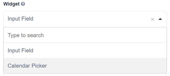
Widget
The widget is the display UI used to input the value of the field. By default, the widget will be set to a traditional Input Field, however, you can change the widget to turn the text field into a calendar picker.
When set, the Textfield is converted to a string-based Calendar Widget. This component stores dates as plain strings, meaning the saved values remain fixed and do not adjust based on the user's location or timezone.
- Single-line text input for short text.
- Uses: capture First/Last Name on a registration form record a short title or identifier (e.g., project name).
Text Area
The Text Area component provides a multi-line input field designed for longer text entries. It can also be configured as a WYSIWYG (What You See Is What You Get) content editor, allowing users to enter and format rich text content.
Click here for more details on the settings
- Component Specific Field
- Example
Rows: Controls how many default rows are set in the Text Area
Editor: This option will convert the text area into one of the following WYSIWYG Editors: Note: Rich text editors may affect the accessibility of forms that use them.
-
Ace -
CKEditor -
Quill
Enable Image Upload - Check this setting to allow image uploads to the WYSIWYG editor.
Image Upload Storage - Select the Storage provided integrated within the Project.
Save As - This setting determines how the value should be entered and stored in the database:
-
String -
JSON -
HTML
Auto Expand: The Text Area will automatically expand vertically as the user types into the field.
Enable Image Upload: Allows the user to upload an image to the WYSIWG Editor
Editor Settings: The following documenation will allow you tooverride the code base of the WYSIWYG Editor, customizing the UI and functionality specific to your needs.
- Multi-line text box for longer free-form text.
- User comments/feedback; product or job descriptions.
- Entering address or description fields.
Number
Use the Number field when input should be restricted to numeric values. This component allows configuration of options such as thousands separators, decimal precision, and whether decimal values are required.
Click here for more details on the settings
- Component Specific Field
- Example
There are no unique settings for the Number component.
- Numeric-only input, supports integers/decimals and step values.
- Number component can be used to enter product quantity and salary or price inputs.
- Employee ID or phone number.
Password
The Password field shares the same configuration options as the Text Field component. However, its underlying HTML type is set to password instead of text, which ensures that entered characters are masked with hidden symbols for security.
Click here for more details on the settings
- Component Specific Field
- Example
There are no unique settings for the Password component.
- Masked text input for secret values.
- Account signup/change password; admin restricted actions.
- Securing access to confidential portals.
Check Box
A checkbox is used to capture a boolean input, representing either a checked (true) or unchecked (false) state. You can also configure options such as Shortcut and Input Type.
Click here for more details on the settings
- Component Specific Field
- Example
Shortcut: Add a keyboard shortcut to check/uncheck the component.
Input Type: The input type can be changed from a single input value checkbox or a multi-valued radio component.
- One or many options with checkboxes (multiple selection).
- Accept Terms & Conditions; multi-select preferences (e.g., newsletter topics).
Select Box
This component lets users select multiple options using a checkbox-style interface. Define the available options in the Data tab, and configure additional settings like value shortcuts and minimum/maximum selection limits.
Click here for more details on the settings
- Component Specific Field
- Example
Data Source Type: The source to use for the Select Box options:
Values: Create your own list of static values for the Select Box options. The Label is the front-end identifier for the end user. The value is the back-end identifier for the option and is what is saved to the Database.
Shortcut: Add a keyboard shortcut for the designated option.
URL: URL that will provide the option values for the Select Dropdown. Use the Item Template to determine what part of the URL's object will be used as.
For instance, if you want to populate a Select Box with a list of countrys, you can achieve this by using an external JSON URL to supply the component's values.
-
Edit the Select Box settings and click the Data tab
-
Change Data Source Type to URL
-
Input the Data Source URL endpoint . This example is using a U.S. state endpoint
https://fake-json-api.mock.beeceptor.com/users -
Set the Item Template to configure the displayed value.
{{ item.country}}
Request Headers
Allows adding custom HTTP headers for API requests when using the URL data source type.
Example:
Authorization - Bearer token
Content-Type - application/json
Useful for authenticated APIs or custom content-type requests
Value Property
Specifies which property from the fetched item should be saved in the submission data.
Item Template
Controls how each option appears in the dropdown list.
-
Uses HTML with Handlebars-style syntax
e.g., item.name -
Change as u need in display the field
<span>{{ item.name }}</span>
- Allows multiple selections.
- Select Box can be used to display multiple choice options for users to select their answer
Select
The Select component presents a dropdown list of values from which users can choose a single option. It supports flexible data sources and offers numerous settings for filtering, querying, and dynamically loading values.
Click here for more details on the settings
- Component Specific Field
- Example
Widget Type: Change the Select dropdown widget type:
Choices.js
HTML 5
Unique Options: Display only unique dropdown options removing repeated values.
Multiple Values: Allows the user to select more than one option. Options are saved like tags on the field when the setting is enabled.
Data Source Type: The source to use for the Select component options:
Value, URL, Resource,** Raw JSON**, and Custom.
- Dropdown/select list able to select only one.
- Country selection; choose department or product category.
- Choosing a department or city or selecting a country from a dropdown.
Radio
The Radio component enables users to choose a single option from a set of radio-style buttons. Users can also click a selected option again to deselect it, reverting the field to its initial state.
Click here for more details on the settings
- Component Specific Field
- Example
Data Source Type: The source to use for the Select Box options:
Values: Create your own list of static values for the Select Box options. The Label is the front-end identifier for the end user. The value is the back-end identifier for the option and is what is saved to the Database.
URL: Designate a URL that will provide the option values for the Select Dropdown. Use the Item Template to determine what part of the URL's object will be used as the option values.
For example, suppose you wish to populate your Select Box with a list of all U.S. States of You can use an external JSON URL like the following.
https://fake-json-api.mock.beeceptor.com/users
Place the URL within the Data Source URL. Provide a Value Property to represent the option which is what will save within the meta-data. When the value is left blank, the entire object will be saved for the option. Modify the Item Template to determine what part of the object the end user will see when choosing an option.
Shortcut: Add a keyboard shortcut for the designated option.
Inline Layout: Displays the option values horizontally
- Single-choice options presented as radio buttons.
- Gender selection or choose payment method (Credit Card / PayPal).
- Choosing Yes/No type responses.
Button
Buttons can be used to execute a variety of actions within a form. While their primary function is to submit the form, buttons can also trigger workflow events, reset field values, authenticate with an OAuth provider, and more. Additionally, the Button component provides numerous settings to customize its style and appearance.
Click here for more details on the settings
- Component Specific Field
- Example
Action: The functionality that executes when the button is clicked. Click the event to show additional settings related to the selected action:
Submit - Submits the form to the back-end server
Save In State - This button action works alongside the Save In State workflow and facilitates a 'Save as Draft' workflow. Inheritently the action will bypass validation giving the submission a different state.
Reset - Reset all fields on the form back to their pristine state
Event - Triggers an 'event' on the form which is usually correlated to application logic or form workflow logic
Oauth - Opens an OAuth authentication popup. This will only work after it has been assigned to an OAuth Action. See the OAuth guide for more information on how to set up OAuth in your project.
Post to URL -
Custom - Write custom code to fire
Save On Enter: Use the Enter key to submit the form
Theme: Set a theme (color) for the button mapped to Bootstrap classes
Size: Determines the position of the option label relative to the option bubble
Block Button: Spans the button horizontally across the form
Left/Right Icon: Set an icon to the left or right side of the button label using Font Awesome icon classes.
Disable on Form Invalid: If any field on the form is invalid, disable the button.
- Action trigger (submit, custom JS action).
- Submit forms; trigger modal or custom workflow.
- Navigating between form steps.