Custom Components
The Custom Components are used to create unique form fields that are not available in the standard library. It allows developers to write their own logic, design, and functionality using JavaScript. With this, you can add specialized input types, apply custom validations, or integrate third-party widgets. This makes forms more flexible and tailored to specific business needs.
Custom Mantine Table Component
A Custom Mantine Table Component is mainly used for handling submission data — such as fetching and displaying form submission records — in a clean and dynamic way. It is a reusable React component built using Mantine’s Table that allows you to display dynamic data with flexible configurations. Instead of hardcoding rows and columns, you pass a columns array (to define headers) and a data array (to populate rows), making it adaptable for any dataset. It supports features like hover effects, striped rows, and borders out of the box, and can be enhanced with search, sorting, pagination, and custom styling to make it more powerful and production-ready. This approach ensures cleaner code, consistency, and easier maintenance across applications.
Component Settings
All settings for configuring your Custom Mantine Table are found under the component’s Attribute tab.
-
Drag and Drop Custom Mantine table under custom group
-
navigate to attribute tab
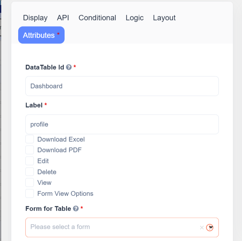
Label
Enter the label name for the table — this is the visible heading or title displayed above the table.
Download Options
- Download Excel – Enable to allow exporting table data as an Excel file.
- Download PDF – Enable to allow exporting table data or individual submissions as PDFs.
Note: PDF download requires the Configure PDF Settings step to be completed beforehand.
Actions
Enable or disable specific row-level actions using checkboxes:
- Edit - Opens a sidebar drawer displaying the full submission data for editing.
- Delete - Instantly removes the selected record from the table submissions.
- View - Opens a modal popup with form new submission data entry.
These determine what appears in the table’s three-dot menu.
View
Enter the label to display on the View button or modal.
Select which form should be used to display submission data in the View modal.
This form defines the layout and fields visible when viewing a record.
Form for Table
Choose the source form whose submission data will populate the table.
Example:
- Parent Form: “User Dashboard”
- Form for Table: “Employee Registration”
The table will list all employee registration submissions.
Attributes (Columns)
Define which fields from the selected form should appear as columns in the table.
| Setting | Description |
|---|---|
| Header Label | The column title to show in the table (e.g., “Full Name”) |
| Header Value | The data key from the submission to display |
| Add/Remove | Add or remove columns dynamically |
How to Use
-
Add the Component
- In the Form Builder, Drag and Drop the Custom Mantine Table component.
-
Configure Table Source
- Choose a Form for Table — this is the data source for submissions.
- Select visible Columns and assign labels.
-
Enable User Actions
- Configure Edit, Delete, View, and Download options as needed.
-
Save and Test
- Save the form.
- Open the form in User Mode to view the interactive Mantine Table in action.
How It Works in User Mode
When users open the form containing the Custom Mantine Table, they will see a table listing submission records.
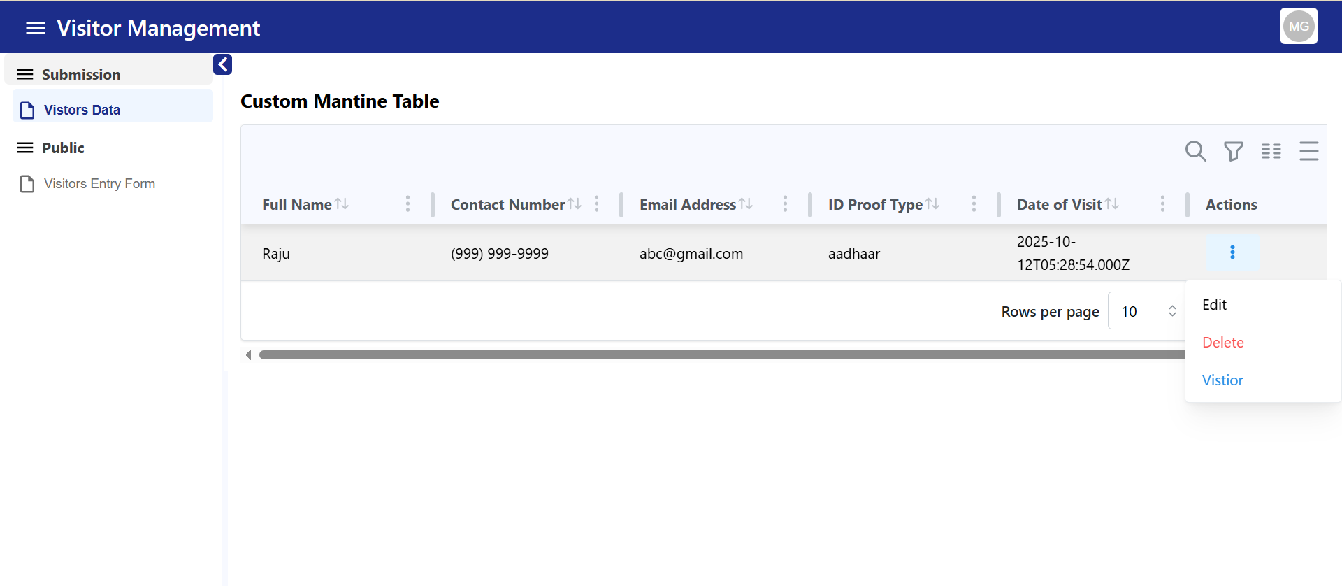
Each record row includes a three-dot menu (⋮) with the following actions:
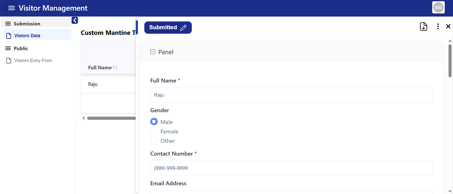
1. Edit
- Opens a sidebar drawer displaying the full submission data for editing.
- Users can make changes and update the submission directly.
- The table refreshes automatically after a successful update.
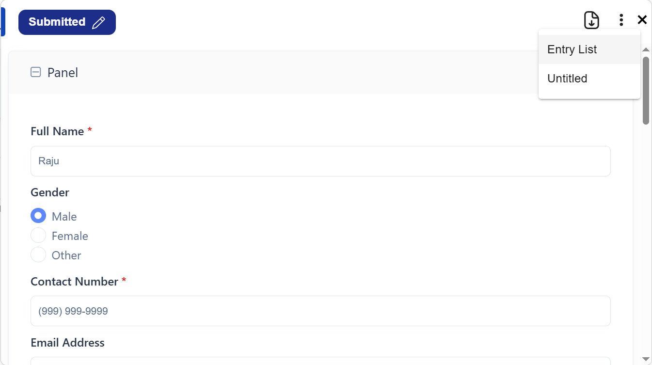
 PDF Download Integration:
If a PDF configuration is set up before form use:
PDF Download Integration:
If a PDF configuration is set up before form use:
-
The Edit sidebar will include a Download PDF button.
-
When clicked, it downloads the selected submission as a formatted PDF.
 Status Management:
 -
The top of the sidebar shows the submission status (e.g., Submitted, Approved, Rejected).
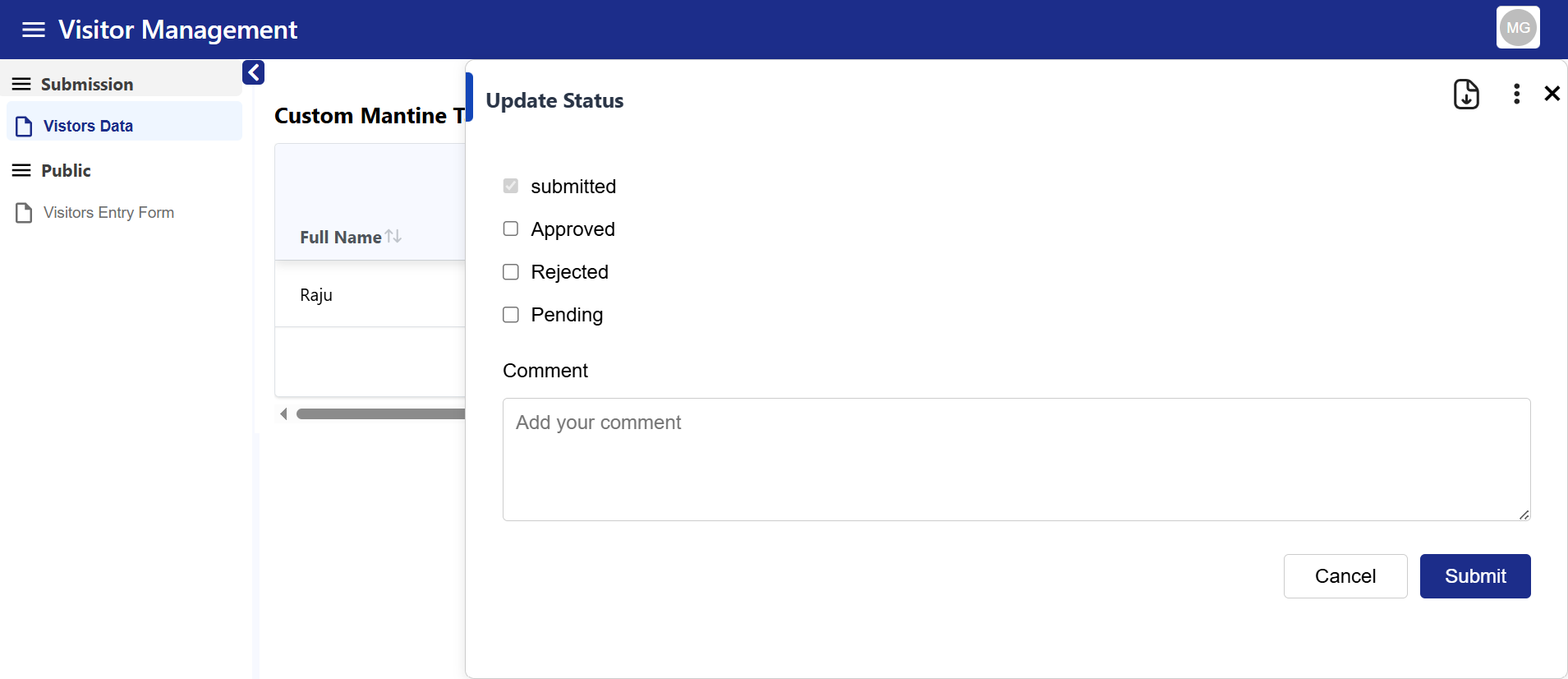
-
Admins can manually update this status:
- Tick the “Update Status Manually” checkbox.
- Select the new status and click Update to apply changes.
2. Delete
- Instantly removes the selected record from the table and submissions.
- A confirmation dialog is typically shown before deletion to avoid accidental data loss.
Note: Deleted submissions cannot be recovered unless versioning or backups are enabled.
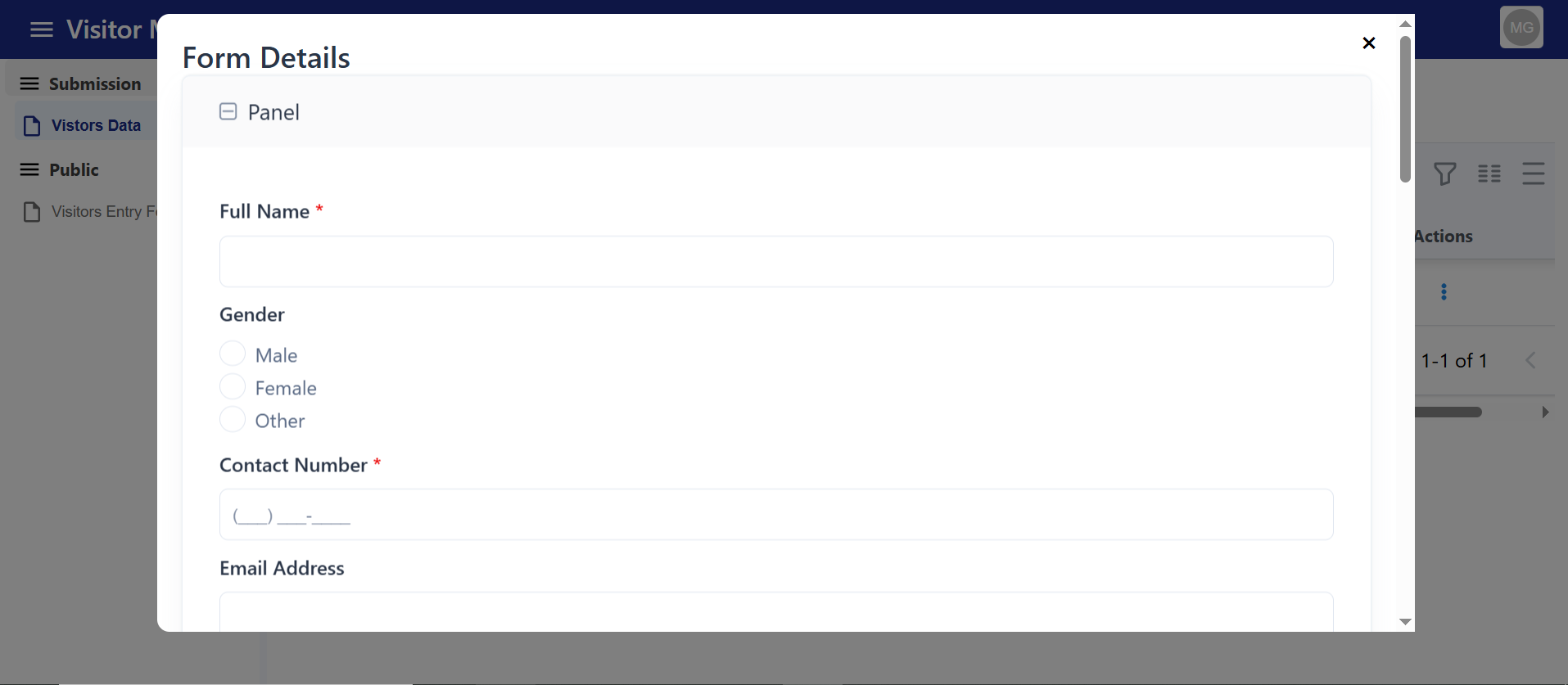
3. View
-
When the user clicks “View” in the Mantine Table, it opens a modal popup displaying the attached form.
-
The form opens inside the modal, allowing the user to enter and submit new data directly.
Custom ID Generator Component
The Custom ID Generator Component is used to automatically create unique identifiers for records, forms, or users. It ensures IDs follow a specific format (like prefixes, suffixes, or numbering sequences) to maintain consistency. This helps in avoiding duplication and makes tracking or referencing data much easier.
How to Use
Go to Attribute tab :
The Attribute setting determines the type of ID your component will auto generate — whether it’s a Alpha Numeric , number sequence, or a globally unique identifier.
ID Type
Select an option from the ID Type dropdown:
-
String → Generates IDs in text format (e.g.,
USER123,EMP001).
Useful when IDs require prefixes, suffixes, or meaningful labels. -
Integer → Generates sequential numeric IDs (e.g.,
1,2,3…).
Ideal for simple counters like invoice numbers, order numbers, or ticket IDs. -
UUID → Generates universally unique identifiers (e.g.,
550e8400-e29b-41d4-a716-446655440000).
Best for ensuring global uniqueness across databases or distributed systems.
Length
Length controls the fixed size of the generated ID, ensuring all IDs are consistent in format.
SearchAddFetch
The Search • Add • Fetch component extends your Customcomponent with powerful dynamic data capabilities.
It allows users to search existing records, add new entries, and fetch related data — all within a single interactive interface.
This component is perfect for scenarios like selecting customers, products, or users from an API, and auto-filling related fields in your form.
The Search • Add • Fetch feature in an HTML Element–based component creates a small interactive data block inside your form.
It supports three core actions:
- Search: Query or filter data from an external or internal API and display the results in a dropdown or list.
- Add: Open a modal form to create and submit a new record (POST request to your API).
- Fetch: Once a record is selected, automatically retrieve and populate additional related data into other form fields.
Together, these functions provide a mini-CRUD experience within a single form — combining HTML for layout and JavaScript logic for data handling, refreshing, and syncing with other form components.
Steps to Configure
- Add the Component
Drag and drop the Search • Add • Fetch component into your form.
- Set the Label and Button Name
Give the component a clear label (e.g., “Customer Search”).
Enter the desired Add button text (e.g., “Add New Customer”).
- Configure the Data Source
Provide the Data Binding URL to fetch existing records from an API .
- Define Display Field
Choose which field (e.g., name, title, or ID) should appear in the search dropdown.
- Set Up Field Mappings
Use Autofill Field Mapping to link data fields from the selected record to form components.
- Save and Test
Save your form and open it in User Mode to test searching, adding, and auto-filling functionality.