Component Settings
Forms are build by placing various components. These components have an array of settings that can be configured to change the interface, behavior, and functionality of the component. Some settings are available on all components, while others are unique to a particular component type. Below is a list of these settings organized by setting type.
Display Settings
Settings that modify the front-end UI of a component. The Display setting tab will open by default when editing the component settings.
Label
The front-end name for the component. By default, the label will display at the top left of the field.

Label Position
The label location of the component. The Lable Position will default to the Top option, but several other options can be selected:
- Top - The Label will display left aligned on the top of the component
- Left (Left-aligned) - The Label will display to the left of the component and aligned to the left of the component width span.
- Left (Right-aligned) - The Label will display to the left of the component and aligned to the right of the component width span.

- Right (Left-aligned) - The Label will display to the right of the component and aligned to the left of the component width span.
- Right (Right-aligned) - The Label will display to the right of the component and aligned to the left of the component width span.

- Bottom - The Label will display left-aligned below the component

Label Width & Margin
When the Left or Right Label Position alignment options are selected, the label width and margin settings will become available. These options allow for padding to be added to the respective position of the component which will create space space between the label and the component. The width and margin values are based on the field's span percentage on the form.
Placeholder
A short descriptive text that describes the expected value that the user should enter in the field. The Placeholder will display when the field is empty and will not be submitted to the server when the form is submitted.

Description
Add a Description that will display below the field. This setting can be used as an alternative to the Placeholder or in addition if further details are needed for the field.

Tooltip
Adding content to the Tooltip setting will add a new UI element to the field represented by a question icon next to the field label. The content inside the Tooltip setting will display when a user hovers over the UI element. Tooltips are a great way of providing detailed instructions or helper tips without taking up space on your form.

Prefix
The Prefix setting adds text or characters before the input field. This can be used to categorize or label a field, like using $ for currency.

Suffix
The Suffix setting adds text or characters after the input field. This can be used to categorize or label a field, like using % to represent a percentage.

Input Mask
Use an Input Mask when a specific input format is needed. This is useful for enforcing formats like phone numbers, postal codes, SSN, etc.

Display Mask
display mask helps to display the input in a readable way, this won't affect the value which will be saved (to affect both view and saved value, delete Display Mask and use Input Mask). Mask Examples
9: numeric a: alphabetical *: alphanumeric
Example a Phone Number mask: (999) 999-9999
Apply Mask On
Determines when this component should trigger the configured mask. Defaults to Change.
Change - Validation will actively trigger any time there is a change in the field. This is the default option for every field.
Blur - Validation will only trigger when the field is no longer focused.
Custom CSS Class
Apply unique styling and formatting to your fields by adding Custom CSS Classes.utilizes Bootstrap as the default CSS framework for the renderer. Below are examples showcasing a few different Custom CSS Classes you may find useful and the class code.
Tab Index
Configure the Tab Index attribute of this component to override the tab order of the form. Setting the tab order for all components on the form gives you control over the entire tab order of the form.
See the MDN documentation for more tab index information.
Auto Complete
Enabled by default, input fields will automatically populate data from values previously entered by the user dictated by the cache of the user's browser. Input the off value inside the setting field to disable.
Hidden
Hidden components do not display on the form but are still part of the form JSON and submission. This setting can be helpful when calculating data that should not be visible to the front-end user
Hide Label
Hides the label of a field. Save vertical space on a form by hiding the field label and utilizing other display settings such as a Placeholder to identify the field.

Hide Input
Masks the input of the field by replacing characters with circle characters often seen on password fields. Use this setting when handling sensitive data such as a Tax ID or Social Security Number.

Show Word Counter
The Show Word Counter option displays the total number of words entered in a text field, helping users stay within a specific word limit. It is particularly useful for long-text fields such as comments, feedback, or descriptions where users need to manage the length of their responses.

Show Character Counter
The number of characters typed in real time. This helps users control the input length for fields with character restrictions and is ideal for shorter text inputs like names, IDs, or titles.

Initial Focus
When the form is rendered, the component with Initial Focused checked will be the focused element on the form.
 Only one component on the form should have the Initial Focus setting enabled. If more than one component on the form has the Initial Focus setting checked, only the last component in the JSON structure with the setting enabled will be focused on the form.
Disabled
The Disabled setting will prevent users from focussing and inputting data into the field. Use Disabled fields in conjunction with Calculated Values to prevent a user from altering calculations or populated values.

Table View
When the Table View setting is checked, the field and underlying data will display within the of the form. "Data is always saved on the server, whether or not the setting is enabled.
Adjust the Table View settings for each component in your form to streamline the submission grid in the Form's Data tab, ensuring that the most relevant data is displayed when reviewing submissions.
Modal Edit
When this setting is enabled, the field is replaced with a button, that when clicked, launches a Modal Window to input and edit field data.
Data Settings
Data Settings are mainly used to manage how user-entered information behaves inside a form. They let you control how data interacts with other fields and how it’s saved on the server. You can use Data Settings to do things like set a default value, apply data logic, or create automatic calculations between fields.
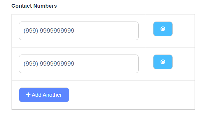
Multiple Value
The Multiple Value setting lets users add or remove multiple entries for the same field using an “Add Another” button that appears below it. When enabled, each added value is stored as a list (array) in the form submission data.
Default Value
Sets a default value that automatically appears in the field when the form loads. If the user doesn’t change it, this default value will be saved as part of the form submission.

Persistent
The Persistent setting controls how the field’s data is stored and submitted. The available options are:
- Server (default): The field data is submitted to the backend and stored on the server.
- Client-only: The field data stays on the front-end and is not submitted or stored on the server. This is useful for temporary data used in calculations or workflows without saving it.
- None: The field data is submitted to the backend but not stored on the server. Use this when you need client-side logic without saving the data.
Protected
This setting will prevent the field data from being queried from an API call. Check this setting if an extra layer of protection is needed for sensitive data.
Database Index
Index the field within the database to increase server-side performance when querying submissions.
Truncate Multiple Spaces
Removes any unnecessary spaces between words or characters within the field.
Encrypted
Adds a server-side Encryption layer to the field. This is a two-way encryption not suitable for passwords. It ensures the security of sensitive data through a multi-layered approach to encryption. At the foundational level, runs on MongoDB, and when using MongoDB Atlas, encryption at rest and in transit is provided by default, using advanced encryption standards to ensure that all data is protected at multiple layers.
Redraw On
Refresh the component when a specific change occurs. The Redraw setting dropdown will offer options to redraw the component when any change occurs on the form or when a specific field on the form changes selectable within the setting dropdown. Use this setting when interpolating data for calculations or logic when dynamic changes occur form.
Custom Default Value
The Custom Default Value lets you set a default field value using custom JavaScript logic that runs when the form loads.
1.In form builder, add a Text field.
-
Label: First Name
-
Key: firstName
-
Save the field.
eg:john
2.Add a second Text field.
-
Label: Last Name
-
Key: lastName
-
Save the field.
eg:doe
3.Add a third Text field (this will hold the combined name).
-
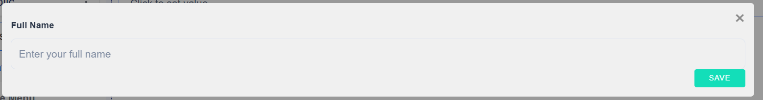
Label: Full Name
-
Key: fullName
-
Open the ettings for the Full Name field and go to the Data tab.
-
Find the Custom Default Value / Calculated Value box (the area where you can add custom JavaScript) and enable it if required.
-
Paste the simple concatenation snippet into the custom value box:
value = data.firstName + data.lastName
4 .Save the Full Name field and then save the whole form.
-
Preview the form and test:
-
Enter a value into First Name and Last Name.
-
The Full Name field should populate automatically with the combined value.
Example: John doe
Calculated Value
- The Custom Default Value section allows you to write JavaScript or JSON logic to automatically calculate or set a value for a field.
- This section runs your JavaScript code inside a secure evaluation environment (sandbox).
- You can use special variables (listed below) to access form data or other field values.
- The final result of your logic must be assigned to a return variable (for example,
value). - The name of the return variable changes depending on where you use the logic.
Example: Basic Field Calculation
Suppose you have two number fields named A and B, and another field named Sum.
To calculate the total automatically, open the Calculated Value tab of the Sum field and write:
-
Add a Number field.
-
Label: A
-
Key: a
-
-
Add another Number field.
-
Label: B
-
Key: b
-
-
Add a third Number field.
-
Label: Result
-
Key: result
-
Open the Result field settings and go to the Data tab.
-
In the Calculated Value box, write this simple calculation:
value = data.a + data.b; -
You can change the operator as needed:
Subtraction:
value = data.a - data.b;Multiplication:
value = data.a * data.b;Division:
value = data.a / data.b;Modulus:
value = data.a % data.b;
-
-
Save the form and preview it. Enter numbers in A and B, and the Result field will automatically update based on your chosen operator.
Example: If A = 5 and B = 5, then Result = 10.
Allow Manual Override of Calculated Value
Allows input data to override any calculations set on the field.
By default, the field value cannot be entered when a calculation is set on the field. Check this setting if you would like users to override the field calculation and set their own value.
Server Override
Overrides current component settings when the form submission is processed on the server side. Add this setting if you want the form component to behave differently on the server side.
It can be useful when conditional components in your form have the 'Omit Value From Submission Data When Conditionally Hidden' option disabled, but you want the hidden data to be removed after the form is submitted. In this case the 'Server Override' setting should be configured as follows:
"clearOnHide": true
Validation
Settings found in the Validation Tab relate directly to the configurable Front-End and Back-End validations for the field. Validation covers settings such as required fields, unique data, min/max requirements, custom validations, and custom error messages.
Validate On
Determines when the field's front-end validation will occur based on the option selected:
Change - Validation will actively trigger any time there is a change in the field. This is the default option for every field.
Blur - Validation will only trigger when the field is no longer focused.
Required
The Required setting is represented by a red asterisk next to the field label and forces the user to enter a value before the form is submitted or the user progresses to the next page of a Wizard form.

Unique
Upon submission, a query is done on the back end to ensure the data entered into the field is unique.
Validate When Hidden
When this setting is enabled, the component is validated when it is hidden or conditionally hidden. The validation errors of the hidden components are shown in the form errors alert when submitting the form.
Minimum / Maximum Length
The Minimum or Maximum length requirement the field value must meet. This behavior changes depending on what component the setting is being applied to.

String (EG Text Field, Text Area) - Determined by the number of characters entered in the field
Number - (EG Number, Currency) - Determined by the numerical amount entered in the field

Array (EG Data Grid, Edit Grid) - Determined by the number of arrays or rows added to the grid
Regular Expression Pattern
Often referred to as Regex, this setting allows you to apply a pattern (or filter) that details a set of strings that must match the pattern. With a Regex Pattern set, the string must match the pattern before the form can be submitted.
Regular Patterns
| Field | Regex Pattern | Description |
|---|---|---|
| Full Name | ^[A-Za-z\s]+$ | Allows only letters and spaces. |
| Phone Number (10 digits) | ^\d{10}$ | Ensures exactly 10 digits. |
^[\w-\.]+@([\w-]+\.)+[\w-]{2,4}$ | Validates standard email format. |
Error Label
Change the field name displayed within the validation message when validation is triggered.

Custom Error Message
Write a Custom Error Message that overrides the default front-end validation message displayed on the form when validation is triggered.
Custom Validation
Expand the Custom Validation tab and write Javascript or JSON logic to set up your own validation rules for the field.
Secret Validation
This setting hides the javascript validation rules defined within Custom Validation from the JSON form definition and component settings for any user that does not carry the Portal Base Project Administrative role.
While the validation will function normally for all users, non-administrative users will see the following JSON in the form definition:
"customPrivate": true
Additionally, the Custom Validation JavaScript code block will be blank for these users when viewing the field settings.
Custom Errors
Set different custom error messages for multiple errors. For example, you could set up multiple error messages to communicate a required field and a min/max amount of characters (in contrast to “Custom Error Message”, which only allows you to set one error message for all errors).
API
Component settings found in the API Tab contain Back-End settings such as the field's Property Name as well as custom properties that can be set such as HTML and Tags.
Property Name
The back-end field identifier for the API endpoint. This field is auto-populated in camelCase based on the initial Label given to the field. Each field's Property Name must be unique on the form before the form can be saved.
Field Tag
There are two pre-defined field tags:
viewer:hide - When set, overrides any exiting logic and hides the component from the PDF display of a submission.
viewer:show - When set, overrides any exiting logic and displays the component in the PDF display of a submission.
The Field Tag provides a flexible method for application layer interaction by letting form builders tag components with information that may be accessed and used inside and outside of the form. It may facilitate different workflows or be used to trigger within workflow logic in the form.
Custom Properties
Apply Custom Properties to the field.
Layout
Apply HTML Attributes / Properties and programmatically reposition PDF fields.
HTML Attributes
Provide a map of HTML attributes for the component's input element.
PDF Overlay
These settings allow the user to programmatically control the field position on PDF First Forms as well as custom styles. Use the margins to fine-tune overlay component locations on your PDF Forms.
Style: Custom styles applied to the component when the PDF is rendered.
Page: The PDF page the component will display on
Left: The Left Margin of the component location within the PDF form defined in pixels.
Top: The Top Margin of the component location within the PDF form defined in pixels.
Width: The width of the component in pixels.
Height: The height of the component in pixels.
Conditions
Create intelligent workflows using workspace's Conditions and Logic system. Show or hide your fields, merge component JSON schema, conditionally set field settings, and more, all based on user interaction on the form.
Logic
Enhance your forms with dynamic behavior using Logic settings. Configure custom actions, conditional value updates, field validations, and event-driven workflows — all without writing complex code. The Logic tab allows you to control how your form components respond to user input, data changes, or submission events.