Design Tab
The Design Tab is the central workspace within Form Studio where you visually build and structure your form using an intuitive drag-and-drop interface. Low Code is required — you can create complex forms quickly by dragging components onto the canvas, configuring settings, and saving or submitting for approval.
Form Studio Tabs
When you open a form for editing, the top navigation bar shows all available tabs. Each tab focuses on a specific aspect of the form lifecycle.
| Tab | Purpose |
|---|---|
| Design | Build the form using drag-and-drop components. |
| Configure | Set submission statuses, PDF templates, device access, and shared submission. |
| Workflow | Connect the form to workflows and automations. |
| Share | Publish the form publicly and generate embed codes. |
| Form Versions | Browse, preview, and restore past versions of the form. |
| Role Visibility | Control which roles can see each individual form field. |
Switching tabs while you have unsaved changes will trigger an Unsaved Changes warning. See the Unsaved Changes Protection section below.
Adding Components
You can add components to your form using the drag-and-drop system:
- The left panel lists all available components organized into groups — Basic, Advanced, Data, Layout, Premium, and Enterprise.
- Click and drag the desired component onto the form canvas.
- Drop it into the position where you want it to appear.
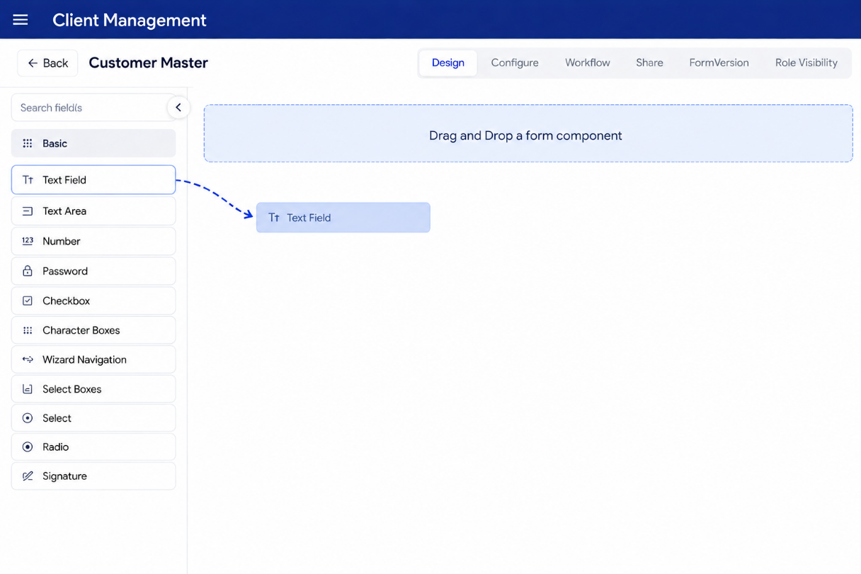
Once a component is dropped:
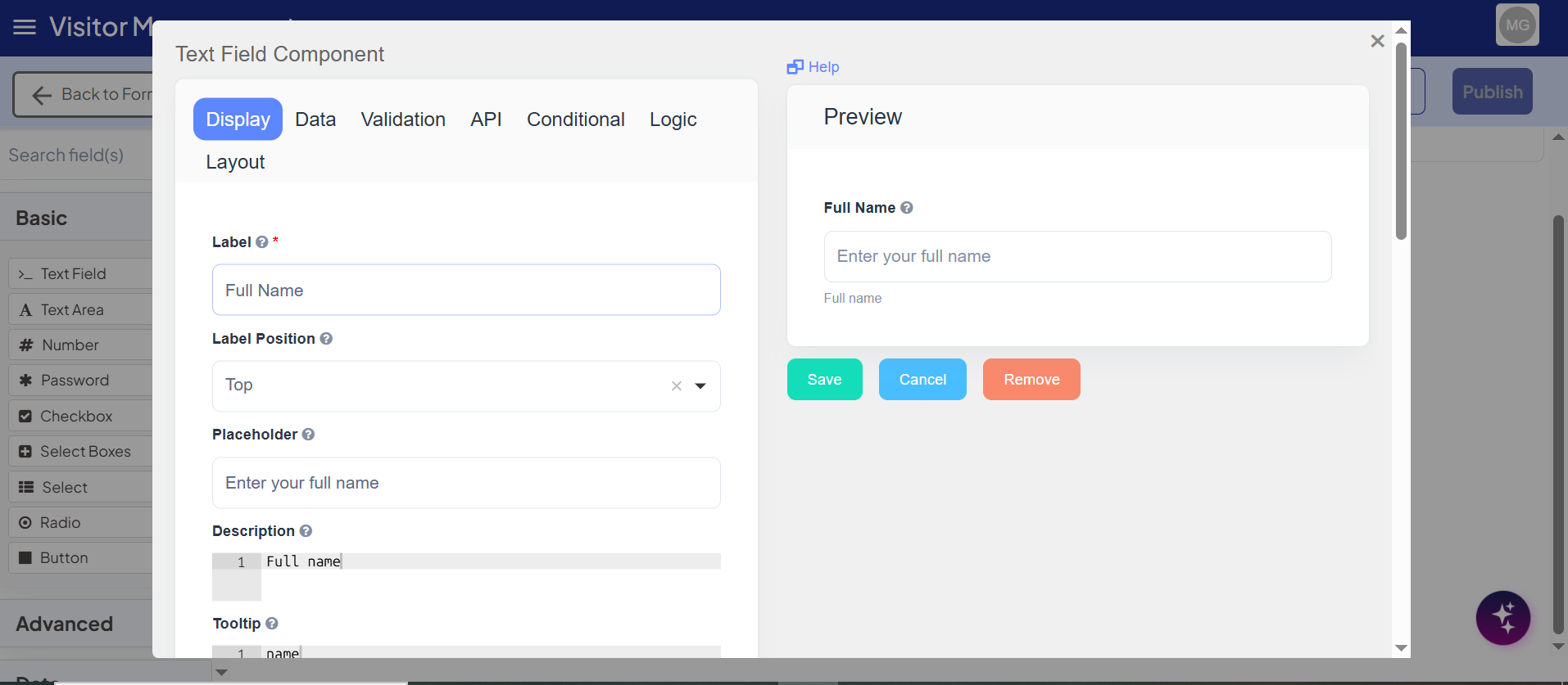
- It is instantly added to the form preview area.
- The component settings panel opens automatically for configuration (label, placeholder, validations, visibility conditions, etc.).
- The component is included in the form's underlying JSON schema, which updates in real time.
Collapsible Component Sidebar
A toggle button at the top of the component panel lets you collapse or expand the left sidebar. This gives more horizontal space to the form canvas when you are working with complex layouts.
- Click the collapse arrow (
<) to hide the sidebar. - Click the expand arrow (
>) to bring it back.
The sidebar state is remembered while you stay on the Design tab.
Inline Component Settings
Once a component is added and saved, inline settings appear when you hover over the field. These controls sit at the top-right of each component.
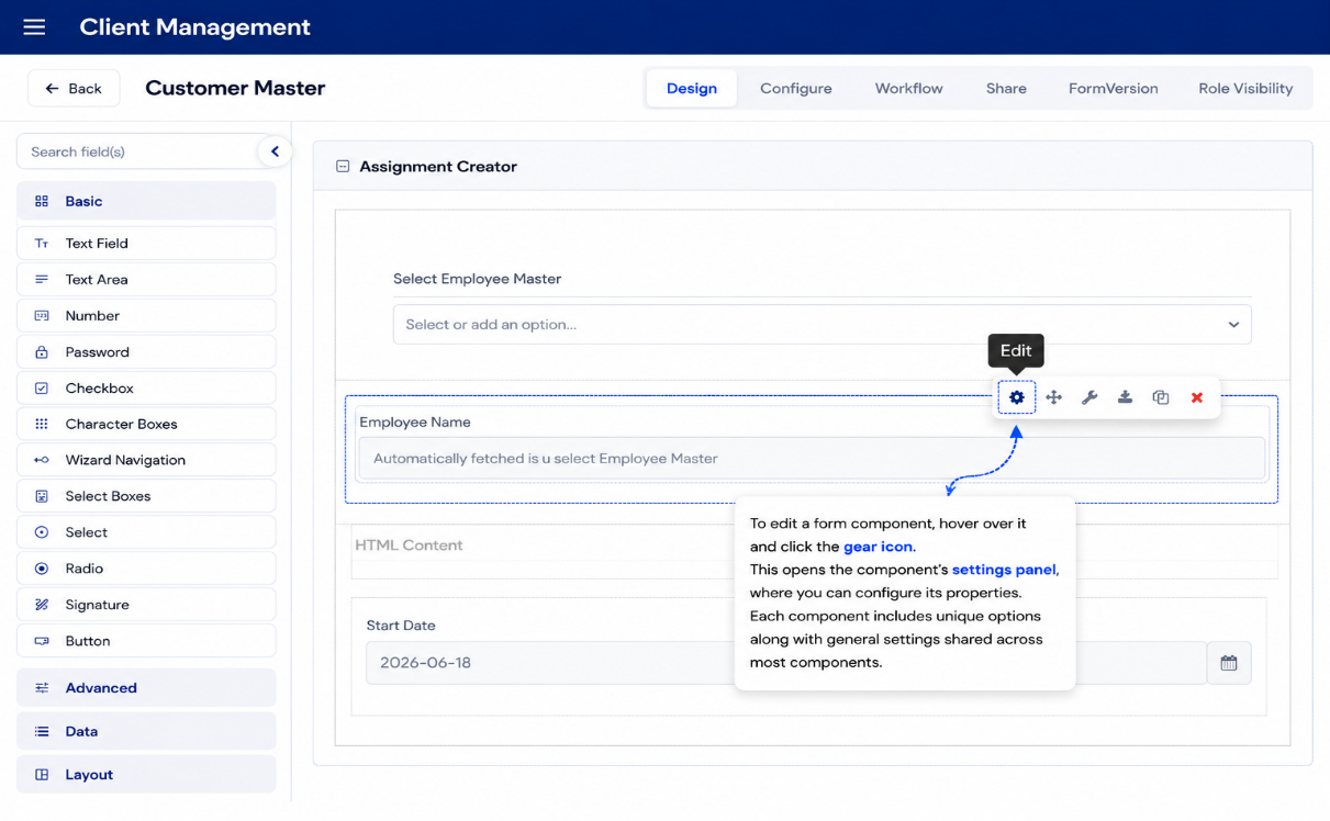
| Control | What It Does |
|---|---|
| Edit | Opens the full settings panel for that component. |
| Move | Click and hold to reposition the component on the canvas. |
| Edit JSON | Directly edit the component's raw JSON schema. Enable Full Schema to see every possible option, including those not currently configured. |
| Copy | Copies the component JSON. A Paste button appears after copying. |
| Paste | Inserts the copied component directly below the component where Paste was clicked. |
| Delete | Removes the component. If deleted unintentionally, navigate away without saving to discard the change. |
Editing the Form Title
The form title at the top of the page is inline editable. Click on the title text to activate the edit field, type your new title, and confirm. The title is saved immediately — no full form save is needed.
Saving Your Form
There are two distinct save actions for form changes. Both are accessible from the top bar.
Save Draft
Saves your current work as a draft without submitting it for review. The form's version status stays as draft and the form remains in its current published state for end users.
- Use this to save work in progress that is not yet ready for review.
- Draft saves do not require change notes.
- The form continues to be accessible to users in its previously published state while the draft exists.
Submit for Approval
Submits the form for an admin to review and approve before the changes go live. When you click Save / Submit, a Change Notes dialog appears.
Change Notes Dialog
Before the form is submitted, you must enter a brief description of what changed. This note is stored with the version and shown to approvers and reviewers.
- The Change Notes field is required — the submission is blocked if it is empty.
- Examples of good change notes:
- "Added phone number field and made address required"
- "Updated dropdown options for department field"
- "Fixed label typo on the date of birth field"
After you enter the notes and confirm, the form version status changes to PendingApproval and the form is queued for an admin to review.
Important: Only an administrator can approve or reject a submitted form. Until approved, end users continue to see the previously published version.
Form Version Lifecycle
Every save action creates or updates a version entry. The version moves through the following states:
draft → pendingapproval → published
                        ↘ rejected (back to draft)
| Status | Color | Meaning |
|---|---|---|
Draft | Gray | Work in progress, not submitted. |
PendingApproval | Orange / Yellow | Submitted and awaiting admin review. |
Published | Green | Approved and live for end users. |
Rejected | Red | Rejected by an admin. The form returns to draft for revision. |
The current approval status of the form is visible in the top bar next to the form title.
For a full guide on viewing, comparing, and restoring past versions, see the Form Version History page.
For the admin approval workflow — including how to approve or reject pending forms — see the Form Approval page.
Unsaved Changes Protection
If you have made changes to the form and try to:
- Switch to a different tab, or
- Navigate back to the project page,
a warning dialog appears:
"You have unsaved changes. Are you sure you want to leave?"
| Option | Result |
|---|---|
| Leave | Discards unsaved changes and navigates away. |
| Stay | Dismisses the dialog so you can save first. |
The same protection applies if you try to close or refresh the browser tab — the browser will ask you to confirm before leaving.
Import and Export
The Design tab supports importing and exporting form schemas as JSON files.
Import JSON Schema
- Click the Import button in the top bar.
- Select a valid
.jsonfile from your computer. - If the form already has existing components, a confirmation dialog asks whether you want to replace the current design with the imported one.
- Confirm to apply — the canvas updates immediately with the imported layout.
Only valid Form.io schema files with a
componentskey are accepted. An error toast appears if the file is not recognized.
Export JSON Schema
- Click the Export button in the top bar.
- The complete form schema — including all components, settings, validations, and logic — is downloaded as a
.jsonfile.
Use this to back up a form design, share it with another team, or import it into a different project.
Usage Example
Example workflow for building a simple Contact Form:
- Drag a Text Field onto the canvas → label it Full Name, mark as required.
- Drag an Email field → label it Email Address, mark as required.
- Drag a Text Area → label it Message.
- Drag a Button → set action to Submit.
- Click Save Draft to save your work in progress.
- When ready for review, click Save / Submit, enter change notes, and confirm.
- An admin reviews and approves — the form goes live for end users.
PDF Forms
When a form is configured as a PDF form, the Design tab switches to a specialized PDF builder with a restricted component set:
| Available in PDF Builder |
|---|
| Text Field |
| Number |
| Select |
| Checkbox |
| Signature |
| Date |
| File |
The drag-and-drop areas correspond to regions of the uploaded PDF document. Components are placed directly over the PDF pages.
The standard component groups (Basic, Advanced, Data, Layout, Premium, Enterprise) are replaced by a single PDF Fields panel when in PDF form mode.