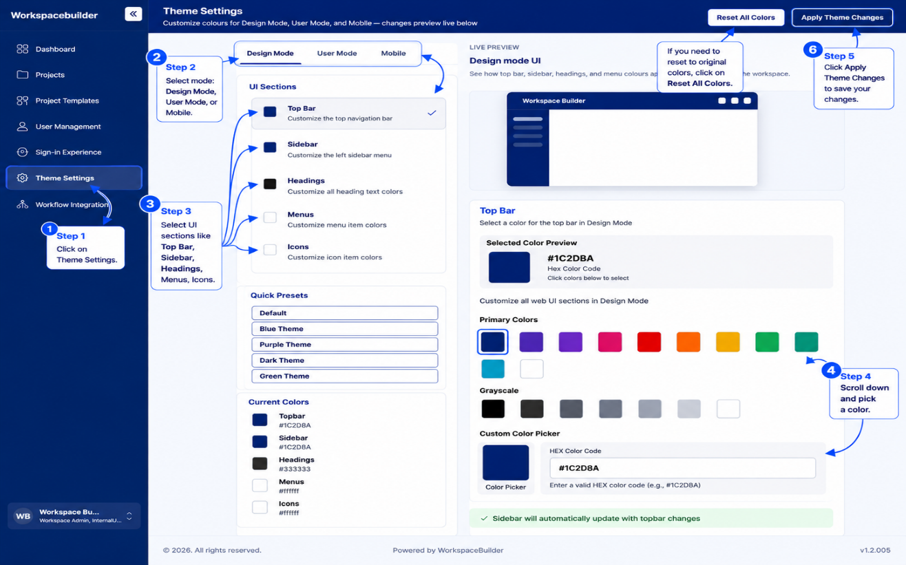
Theme Settings
Theme Settings lets Admins customize the visual appearance of the workspace for three audiences — designers working in Design Mode, end-users in User Mode, and mobile app users. Changes are previewed live and saved to the database.
Access: Available to users with Admin or Designer roles. Navigate via the sidebar.
Page Layout
The page is split into two panels side by side:
- Left panel — mode tabs, UI section selector, quick presets, current color swatches
- Right panel — live preview of the theme, color palette picker, and custom color input
A top action bar provides Reset All Colors and Apply Theme Changes buttons.
Mode Tabs
Three tabs at the top of the left panel switch between the palette being edited:
| Tab | What it customizes | Palette saved as |
|---|---|---|
| Design Mode | Colors seen by designers | custom_palette |
| User Mode | Colors seen by end-users (falls back to Design Mode if not set) | user_palette |
| Mobile | Colors for the mobile app | mobile_palette |
UI Sections
Web (Design Mode and User Mode)
Clicking a section in the list targets it for color editing. The currently selected section is highlighted and shows a checkmark.
| Section | What it colors |
|---|---|
| Top Bar | Application top navigation bar |
| Sidebar | Left navigation sidebar |
| Headings | All heading text across the app |
| Menus | Menu item text |
| Icons | Icons in the topbar and sidebar |
Sidebar sync: By default the sidebar color follows the topbar color automatically. When the topbar is changed to a non-white color the sidebar updates to match. The sidebar can be decoupled by manually selecting a different sidebar color.
User Mode shows only Top Bar and Sidebar — the other sections are not customizable per user.
Mobile
| Section | What it colors |
|---|---|
| Top Bar | Mobile app top bar background |
| Bottom Navbar | Mobile bottom navigation bar background |
| Icons | Icon color used in the bottom navbar |
Color Picker
The right panel provides three ways to pick a color:
- Primary Colors — a row of 11 preset color swatches (blue, indigo, purple, pink, red, orange, yellow, green, teal, cyan, white)
- Grayscale — six swatches from black to white
- Custom Color Picker — a native color-picker wheel plus a HEX text input for any color
The currently selected color is highlighted with a ring and displayed in a large preview box with its hex code.
Quick Presets
Five preset themes are available as one-click options in the left panel. Selecting a preset applies all section colors at once for the active mode.
| Preset | Top Bar / Sidebar | Headings |
|---|---|---|
| Default | #1C2D8A | #333333 |
| Blue Theme | #1C2D8A | #333333 |
| Purple Theme | #805AD5 | #2D3748 |
| Dark Theme | #1A202C | #E2E8F0 |
| Green Theme | #276749 | #1C4532 |
Live Preview
The right panel shows a real-time mockup that reflects the colors currently selected.
- Web mockup — a miniature UI showing the topbar, sidebar, and icon dots
- Mobile mockup — a phone shell showing the topbar and bottom navbar
The preview updates immediately when any color is changed, before the changes are saved.
Applying and Saving
Apply Theme Changes
Clicking Apply Theme Changes opens a confirmation dialog. On confirm:
- The new colors are applied to the current session (sidebar context is updated immediately)
- The palette is saved to the API:
- PATCH if a theme record already exists for the organization
- POST if no theme record exists yet
- The page refreshes its data from the API to stay in sync
Reset All Colors
Clicking Reset All Colors opens a confirmation dialog. On confirm, all three palettes (Design Mode, User Mode, Mobile) are reset to the default blue palette (#1C2D8A) locally. The reset is only persisted to the database when Apply Theme Changes is clicked afterward.
Default Colors
| Element | Default Color |
|---|---|
| Top Bar | #1C2D8A |
| Sidebar | #1C2D8A |
| Headings | #333333 |
| Menus | #ffffff |
| Icons | #ffffff |
| Mobile Top Bar | #1C2D8A |
| Mobile Bottom Navbar | #1C2D8A |
| Mobile Icons | #ffffff |