Design Mode
Project Creation
After successful login, you are redirected to the Dashboard. From here, you can navigate to Design Mode to create and organize projects.
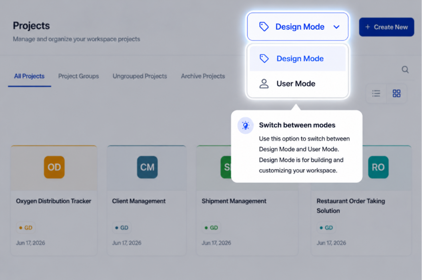
Step 1: Switch to Design Mode
In the top navigation bar, click on Design Mode to enter the workspace where you can manage and create projects.
Note: Only users with Admin Role can access to create new projects.
Step 2: Create a New Project
Once you are in Design Mode, you will see a "+ Create New" button at the top of the page.
Clicking this button opens a Project Creation Modal.
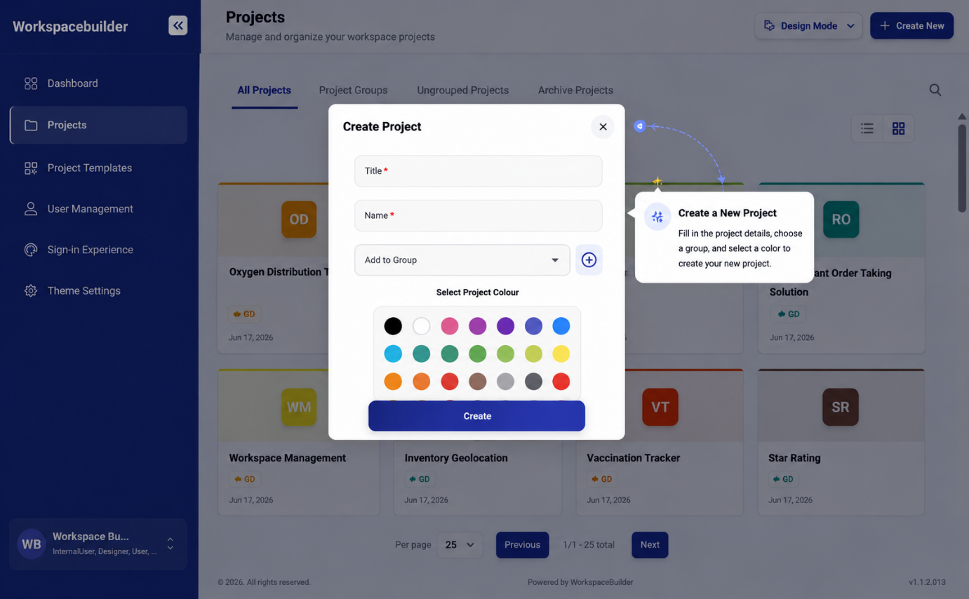
Project Creation Modal Fields
Inside the modal, fill in the following details:
| Field | Description |
|---|---|
| Title | The display name of your project (e.g., "Marketing Portal"). |
| Name | Automatically generated from the title (lowercase, no spaces). Used internally for consistency. |
| Group | Choose an existing group from the dropdown or click the "+" icon to create a new group. |
| Color | Select a color to visually identify your project easily. |
Once all fields are filled, click Create to add the project to your dashboard.
Tip: Organizing projects by group and color helps maintain a clean, visually distinct workspace.
Step 3: Project Segregation
The following features help you organize and access your projects efficiently:
1. All Projects – Shows every project you've created in one place.
2. Project Groups – Displays projects organized into specific groups.
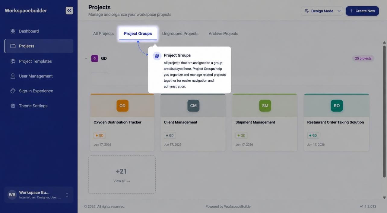
3. Ungrouped Projects – Lists projects that are not assigned to any group.
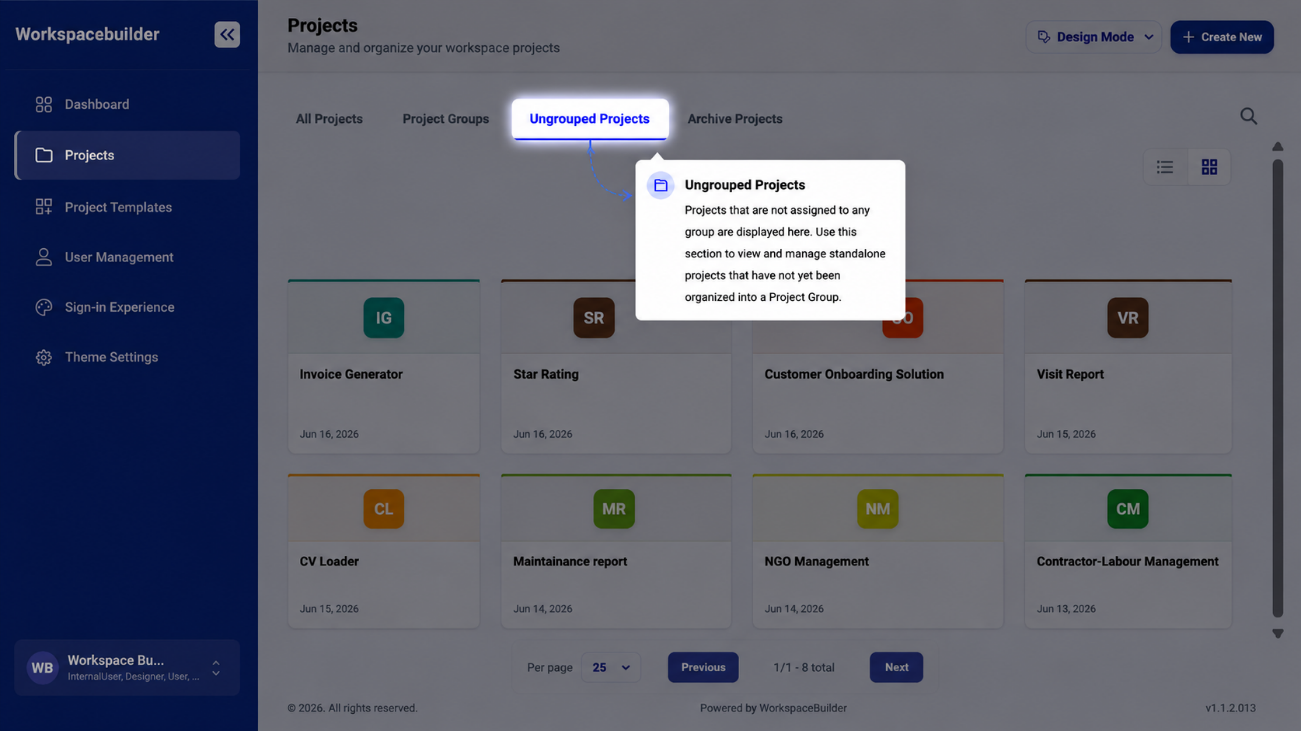
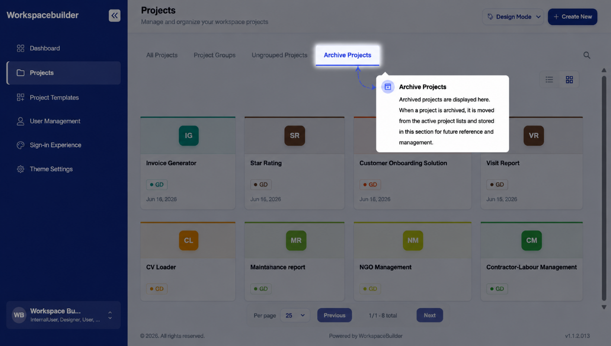
4. Archive Projects – Stores projects that are no longer active but kept for reference.
Step 4: Searching and Pagination
In the Dashboard, a Project Search Bar helps you find projects quickly by name or keyword.
Additionally, you can control how many projects appear per page using the Projects Per Page setting.
The Design Workflow
Once a project is created, the work inside it follows a clear sequence — from setting it up, to building forms, to publishing them for users. Every stage below links to the detailed guide for that step.
Flow at a Glance
Project Created
      │
      ▼
 Project Settings  ──────────────────────────────────────────────┐
 (roles, users, menus, ACL)                                      │
      │                                                           │
      ▼                                                           │
 Create a Menu                                                    │
      │                                                           │
      ▼                                                           │
 Create a Form  (Classic / Wizard / PDF / Dashboard)             │
      │                                                           │
      ▼                                                           │
 Open Form Builder → Start Designing                             │
      │                                                           │
      ├──▶ Drag & Drop Components (Basic / Advanced / Data /     │
      │         Layout / Premium / Custom)                        │
      │                                                           │
      ├──▶ Component Settings → Conditional / Logic Rules        │
      │                                                           │
      ├──▶ Role Visibility (per-field access per role)           │
      │                                                           │
      ├──▶ Workspace AI (auto-generate fields from a prompt)     │
      │                                                           │
      ▼                                                           │
 Submit for Approval                                             │
      │                                                           │
      ▼                                                           │
 Approved → Form Goes Live                                       │
      │                                                           │
      ├──▶ Configure  (status, device view, shared submission)   │
      ├──▶ PDF Settings  (design & attach PDF template)          │
      ├──▶ Workflow  (email, Slack, webhook, OTP triggers)       │
      └──▶ Share  (public link, iframe embed)          ◀─────────┘
Stage 1 — Project Settings
Before building, configure the project itself — who can access it, which roles exist, and how the navigation looks.
| Setting | What it controls | Guide |
|---|---|---|
| Menu Configurations | Layout style and colour of the User Mode navigation | Menu Configurations |
| Users | Invite project members and assign roles | Users |
| Roles and Permissions | Define custom roles and their allowed actions | Roles and Permissions |
| UI Access Control List | Control which roles can see each menu and form | UI Access Control |
| Unique ID Configurations | Auto-incrementing ID sequences for form fields | Unique ID Configurations |
| External Users Signup | Public self-registration URL for external users | External Users Signup |
Stage 2 — Create a Menu
Forms live inside Menus. A menu is a named group in the project sidebar. You must create at least one menu before adding any forms.
- Open the project — the project workspace opens automatically.
- Click Create Menu in the sidebar.
- Enter a Menu Name and choose an Icon.
- Click Create Menu to confirm.
Stage 3 — Create a Form
With a menu in place, add forms under it. Click Create Form under the target menu and select a form type.
| Form Type | Best for | Detail Guide |
|---|---|---|
| Classic Form | Single-page data collection | Form Categories |
| Wizard Form | Multi-step guided flows | Form Categories |
| PDF Form | Overlay fields on an uploaded PDF | PDF Forms |
| Dashboard | Charts, KPI cards, and data tables | Dashboard |
After selecting the type, enter a Form Name and Icon, then click Create Form.
→ Full Form Creation Guide · Form Types Comparison
Stage 4 — Open the Form Builder
After form creation, click Start Design to enter the Form Builder. The builder is split into Form Studio — four modes that cover the complete form lifecycle.
Stage 5 — Build: Drag & Drop Components
In the Design tab, drag components from the left palette onto the canvas. Components are grouped by type.
| Component Group | What's included | Guide |
|---|---|---|
| Basic | Text, email, number, phone, date, checkbox, select, file | Basic Components |
| Advanced | Signature, data grid, hidden field, survey, and more | Advanced Components |
| Data | Components that fetch or display data from external sources | Data Components |
| Layout | Panels, columns, tabs, and containers | Layout Components |
| Premium | Mantine tables, modals, and advanced UI widgets | Premium Components |
| Custom | User-defined HTML/CSS/JS components | Custom Components |
→ Form Components Overview · Design Tab
Stage 6 — Configure Component Behaviour
After placing components, fine-tune how they behave using the three settings tabs on each component.
| Settings Tab | Purpose | Guide |
|---|---|---|
| Component Settings | Label, API key, placeholder, validation, default value | Component Settings |
| Conditional Settings | Show, hide, enable, or disable based on other field values | Conditional Settings |
| Logic Settings | Advanced rules that trigger actions or modify values | Logic Settings |
Stage 7 — Role Visibility
Control which roles can see each individual component. This lets you build a single form that shows different fields to different users.
Stage 8 — Workspace AI (Optional)
Use the built-in AI assistant to auto-generate form fields from a plain-English description. The AI outputs fields in JSON format that are directly loaded into the Design canvas.
Stage 9 — Submit for Approval
When the form is ready, click Submit for Approval. The form enters a PendingApproval state. An Admin must review and approve the changes before the form goes live for end users.
- Approve — form version is published and becomes active.
- Reject — form is returned to the designer with comments.
→ Form Approval · Form Version History
Stage 10 — Post-Approval: Configure, PDF, Workflow, Share
Once approved, use the remaining Form Studio tabs to complete the form's behaviour and distribution.
Configure
Set form status, restrict access by device type, and configure shared submission settings.
PDF Settings
Design a print-ready PDF template and attach it to the form. Users can download a filled PDF from any submission.
Workflow
Set up automation triggers that fire when a form is submitted — send emails, post Slack messages, call webhooks, or send OTP codes.
Share
Publish the form via a public link or embed it in any website using an iframe or JavaScript snippet.
Version History
Every saved state of a form is stored as a version. You can browse the full history, preview any past version, and restore an older version back into the designer at any time.