Dashboard
A Dashboard is a dedicated analytics canvas that visualises data from your project's form submissions using charts, widgets, and tables — without writing any code. Unlike other form types, a Dashboard does not collect user input; it presents submission data in a structured, interactive display.
Creating a Dashboard
- In the project sidebar, click Create Form under the menu where you want the dashboard to live.
- Select Dashboard as the form type.
- Name the dashboard and confirm.
- On the canvas that opens, click Create Dashboard to enter the dashboard designer.
- Add, configure, and arrange components using drag-and-drop.
Tip: The sidebar collapses automatically when a dashboard is open in User Mode, giving the canvas full-width space.
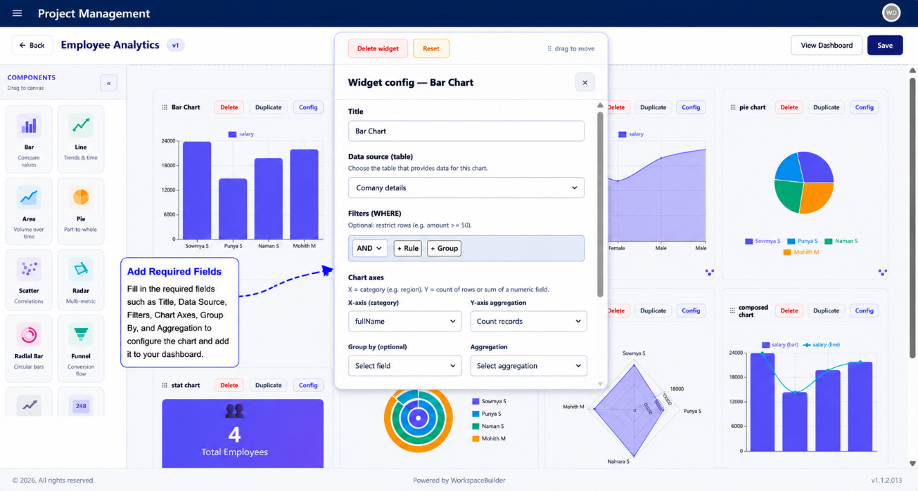
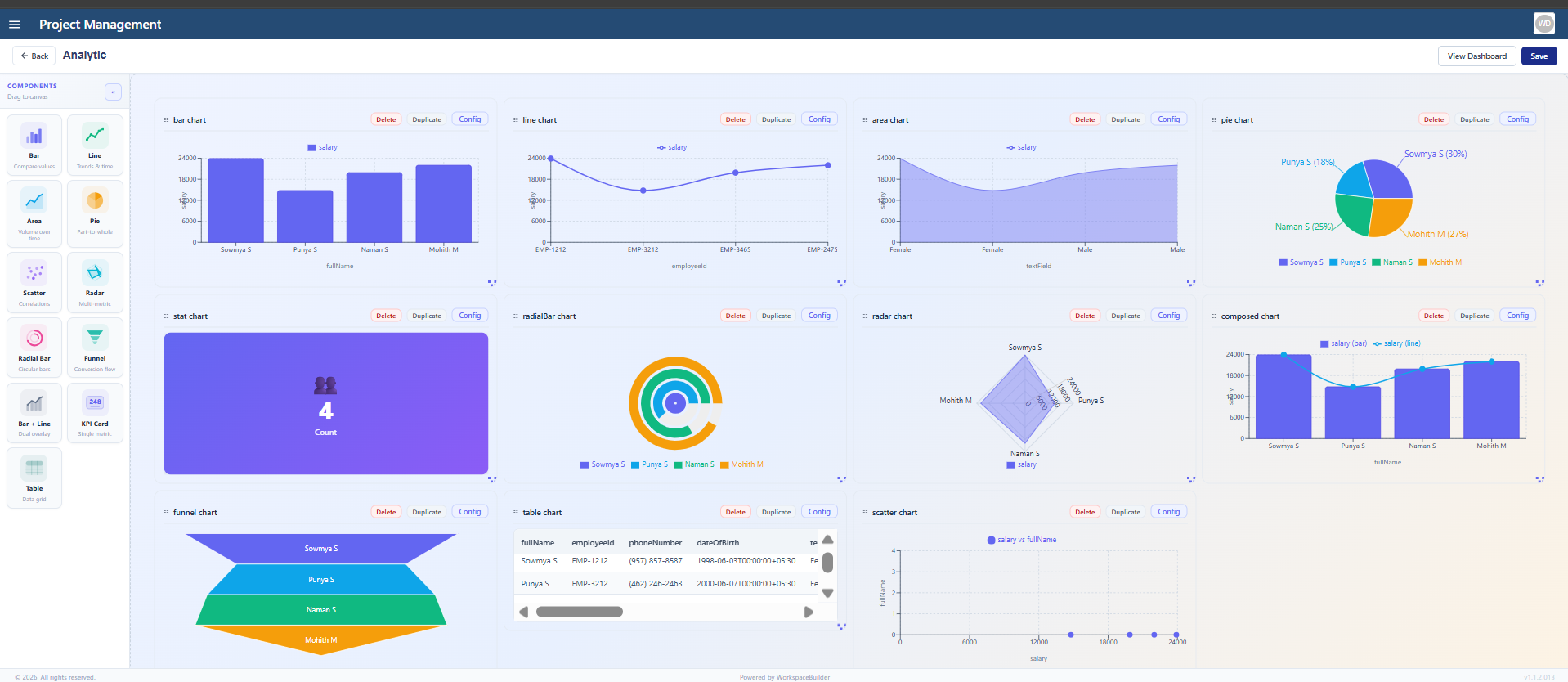
Dashboard Components
The dashboard designer provides 11 component types. Each component is configured by selecting the data source (form and field) and the display options relevant to that chart type.
Bar Chart
Displays categorical data as vertical or horizontal rectangular bars. Each bar represents a category and its height (or length) represents its value.
Best used for: Comparing values across distinct categories — for example, number of submissions per status, or counts grouped by department.
| Setting | Description |
|---|---|
| Data Source | Form and field to aggregate |
| X Axis | The category field (e.g. status, department) |
| Y Axis | The numeric value to measure (e.g. count, sum) |
| Orientation | Vertical (default) or horizontal bars |
| Colour | Bar fill colour |
Line Chart
Plots data points connected by a continuous line, showing how a value changes over a sequence — typically time.
Best used for: Tracking trends over time — for example, submissions per day, approvals per week, or activity over a date range.
| Setting | Description |
|---|---|
| X Axis | Time or sequence field (e.g. submission date) |
| Y Axis | Numeric value to measure |
| Smooth | Toggle smooth curve vs. sharp angles between points |
| Data Points | Show or hide individual dot markers on the line |
Area Chart
Identical to a Line Chart but fills the region between the line and the X-axis with a colour. The filled area makes volume easier to read at a glance.
Best used for: Visualising cumulative volume or showing how a quantity grows or shrinks over time.
| Setting | Description |
|---|---|
| X Axis | Time or sequence field |
| Y Axis | Numeric value to measure |
| Fill Opacity | Transparency of the filled area (0–1) |
| Stacked | Stack multiple series areas on top of each other |
Pie Chart
A circular chart divided into slices where each slice represents a category's proportion of the total.
Best used for: Showing part-to-whole relationships — for example, percentage of submissions by type, or share of records per assigned user.
| Setting | Description |
|---|---|
| Category Field | Field whose unique values become slices |
| Value Field | Numeric field to sum per slice (or count if left blank) |
| Legend | Show or hide the slice legend |
| Labels | Display percentage or value labels inside each slice |
Scatter Chart
Plots individual data points on a two-axis grid using X and Y coordinates. No lines or bars — each point represents a single record.
Best used for: Identifying correlations, clusters, or outliers across two numeric dimensions — for example, plotting submission duration against record size.
| Setting | Description |
|---|---|
| X Axis | First numeric field (horizontal position) |
| Y Axis | Second numeric field (vertical position) |
| Point Size | Diameter of each plotted dot |
| Colour By | Optional field to colour-code points by category |
Radar Chart
A spider-web style chart that plots multiple variables on radial axes radiating from a central point. Each variable gets its own axis and values are connected to form a polygon.
Best used for: Comparing multiple attributes for one or more entities side by side — for example, performance scores across different metrics for two teams.
| Setting | Description |
|---|---|
| Axes | List of fields/metrics to display as radial spokes |
| Series | One or more data series (each becomes a polygon) |
| Fill | Fill the polygon area with a semi-transparent colour |
| Grid Lines | Show or hide the background web grid |
Radial Bar Chart
A bar chart arranged in a circular layout. Each bar arcs from the centre outward — or from one edge of a circle — to show progress or proportional values.
Best used for: Showing progress toward a goal per category, or part-to-whole relationships where visual impact matters more than precise reading.
| Setting | Description |
|---|---|
| Category Field | Field whose values become individual arcs |
| Value Field | Numeric field that determines arc length |
| Inner Radius | Size of the empty circle at the centre |
| Start / End Angle | Angular range of the chart (default full 360°) |
Funnel Chart
Displays a series of stages where each stage narrows, representing the progressive drop-off of data through a pipeline.
Best used for: Conversion or pipeline analysis — for example, showing how many submissions move from Submitted → Under Review → Approved → Closed.
| Setting | Description |
|---|---|
| Stage Field | Field whose values define each funnel stage |
| Value Field | Count or numeric value per stage |
| Sort Order | Order stages by value (descending) or by a custom field order |
| Labels | Show stage name, value, and/or percentage on each segment |
Bar + Line (Combo Chart)
Combines a Bar Chart and a Line Chart on the same canvas sharing the same X-axis. Each series can independently be displayed as a bar or a line.
Best used for: Comparing two related but differently-scaled metrics — for example, daily submission count (bars) alongside a rolling average (line).
| Setting | Description |
|---|---|
| X Axis | Shared category or time field |
| Bar Series | Field(s) to display as bars (left Y-axis) |
| Line Series | Field(s) to display as a line (right Y-axis) |
| Dual Y Axis | Enable a second Y-axis for the line if scales differ |
KPI Card
Displays a single headline metric as a large, bold number with a label and an optional comparison value or trend indicator.
Best used for: Surfacing the most important number at a glance — for example, total submissions this month, open records, or average approval time.
| Setting | Description |
|---|---|
| Metric | The field or calculation to display (e.g. count, sum, average) |
| Label | Descriptive title shown below the number (e.g. "Total Submissions") |
| Comparison Value | Optional secondary number to show change (e.g. vs. last month) |
| Trend Indicator | Arrow or colour change showing increase / decrease |
| Icon | Optional icon displayed alongside the metric |
Table
Displays raw or aggregated submission data in a row-and-column grid — similar to a spreadsheet view.
Best used for: Showing detailed records directly inside a dashboard, or presenting a structured summary with multiple columns per entry.
| Setting | Description |
|---|---|
| Data Source | Form whose submissions populate the table |
| Columns | Fields to display as table columns (label and field key) |
| Rows Per Page | Pagination size for the table |
| Sorting | Default sort column and direction |
| Search | Enable or disable a search bar above the table |
Arranging Components
All components are placed on the dashboard canvas using drag-and-drop:
- Move — click and drag a component by its header to reposition it.
- Resize — drag the bottom-right handle to change the component's width and height.
- Delete — click the remove icon on the component header to delete it.
Changes are saved when you click Save in the dashboard designer toolbar.
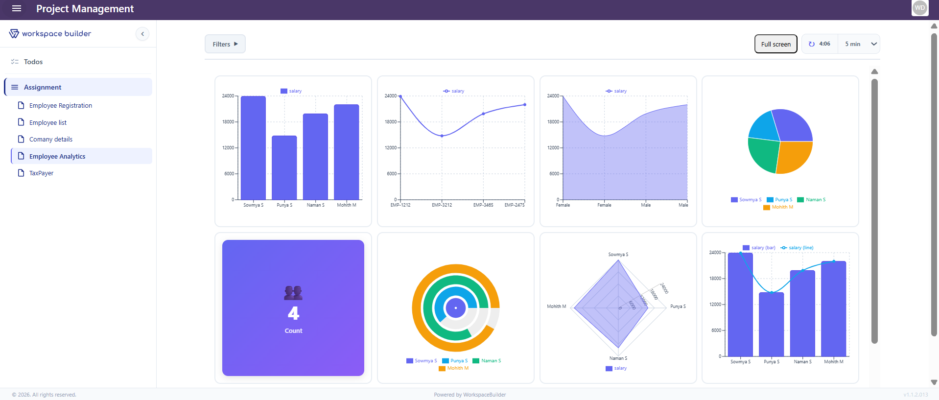
Switching Between View and Edit Mode
| Mode | Description |
|---|---|
| Edit Mode | Shows the designer with drag-and-drop controls and component settings |
| View Mode | Shows the live dashboard with real submission data — no editing controls |
Click Edit in the header to enter Edit Mode. Click Save or Cancel to return to View Mode.
Notes
- Dashboard data is scoped to the current project — it reads from that project's form submissions only.
- All chart data refreshes each time the dashboard is opened in View Mode.
- Dashboards support version control and approval workflows the same as other form types.
- The Export option is available to share dashboard configurations across projects.