PDF Forms
PDF Forms let you upload an existing PDF document and place interactive overlay fields directly on top of it — turning a static PDF into a fully functional, submittable digital form without redesigning it from scratch.
PDF Forms are one of four form types in WorkspaceBuilder. For a comparison of all types, see Form Categories.
How PDF Forms Work
Instead of building a form from blank fields, you start with a real PDF file. The platform:
- Converts the PDF into a rendered HTML view
- Automatically detects any existing form fields in the PDF
- Lets you drag and drop interactive overlay components on top of any page
- Collects and stores submitted data just like a Classic or Wizard form
The underlying PDF layout is always preserved — overlays sit on top without altering the original document.
Step 1 — Create a PDF Form
- Click the Create Form button under a menu in the sidebar.
- Select PDF Form from the form type dialog.
- Enter a Form Name and choose an Icon, then click Create Form.
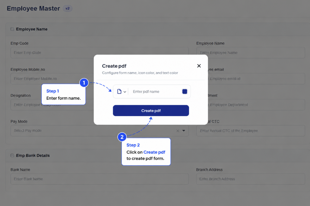
Name the form to reflect the document it is based on — for example, Employee Consent Form or KYC Verification — Individual.
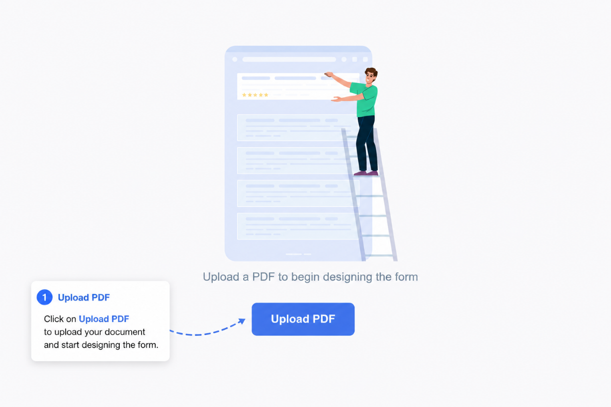
Step 2 — Upload the PDF
After creating the form, you are immediately prompted to upload a PDF file.
- Click Upload PDF in the prompt that appears.
- Select a
.pdffile from your local machine. - The platform uploads, converts, and renders the PDF automatically.
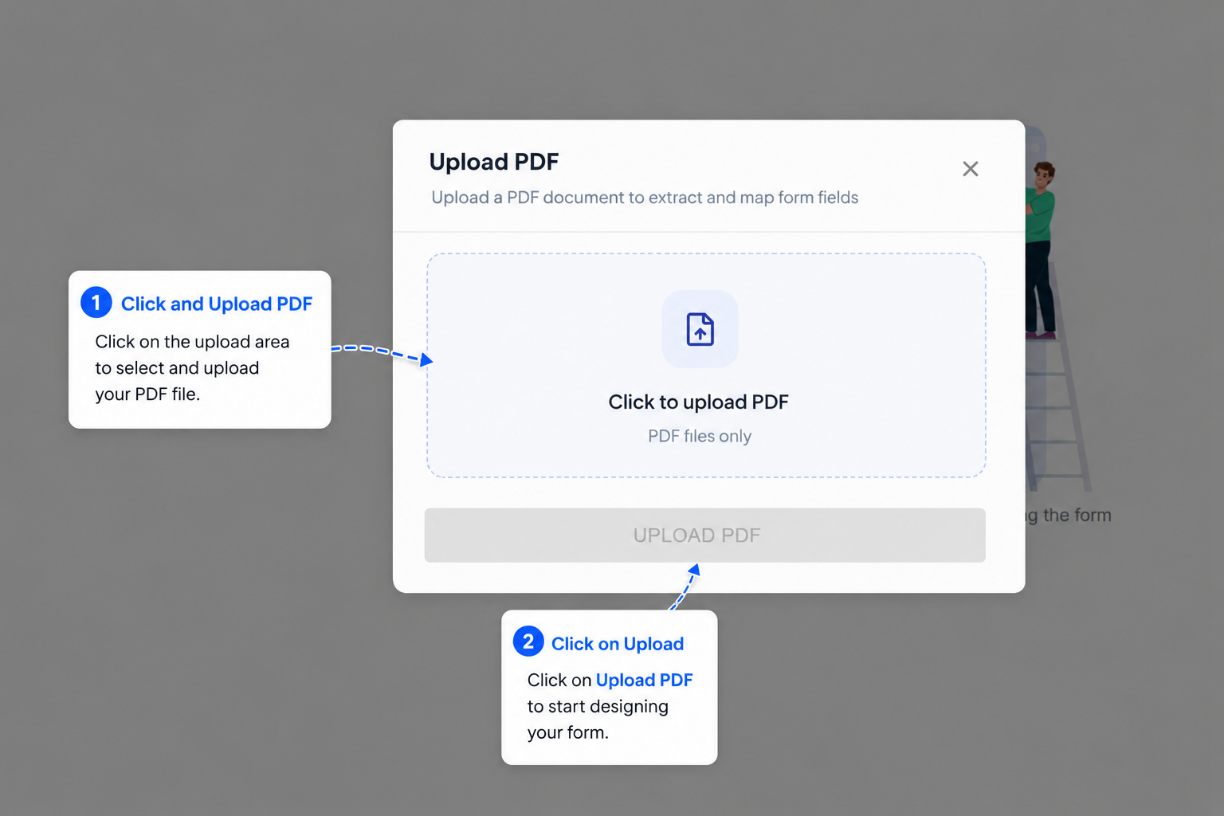
Once submissions exist for a PDF form, the underlying PDF cannot be replaced. Upload the final version of your PDF before collecting any data.
Step 3 — Review Auto-Detected Fields
After upload, the platform scans the PDF for existing form fields (text inputs, checkboxes, etc.) and automatically maps them as overlay components.
- Detected fields appear pre-placed on the canvas in their original positions.
- Review each detected field to confirm the Label and API Key are correct.
- Remove any auto-detected field you do not want to include.
Auto-detection works best on PDFs that were originally created with fillable fields. Scanned image PDFs may detect fewer fields automatically.
Step 4 — Add and Configure Overlay Components
Use the drag-and-drop builder to add additional fields or adjust existing ones.
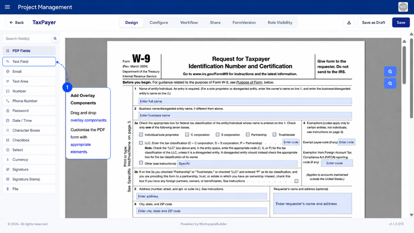
Available Overlay Components
| Component | Description |
|---|---|
| Text Field | Single-line text input |
| Text Area | Multi-line text input |
| Email address field with format validation | |
| Number | Numeric input |
| Phone Number | Phone number input |
| Password | Masked text input |
| Date & Time | Date and/or time picker |
| Checkbox | Single checkbox or radio group (see below) |
| Currency | Monetary value input |
| Select | Dropdown selection list |
| File | File attachment upload |
| Signature | Signature capture field |
| HTML | Static HTML content block |
These components behave like their standard counterparts but have been adjusted for PDF placement. Changes apply only within PDF forms and do not affect standard web form behavior.
Adding a Component
- Locate the component in the palette on the left.
- Drag it onto the PDF canvas and drop it in the desired position.
- The component is placed exactly where you drop it — this position is saved.
- Each overlay shows its component type label (e.g.,
Text Field,Checkbox) inside the overlay box for easy identification.
Repositioning a Component
- Click and drag any overlay to move it to a new position on the PDF.
- Release to set the new position.
Resizing a Component
- Hover over a component to reveal the blue sizing handle at the bottom-right corner.
- Click and drag the handle to adjust the width and height.
- Resizing does not affect the component's position.
- Zoom into the PDF canvas for fine-grained adjustments on small fields.
- Resize fields to match the visual boundaries of the original PDF's field areas.
- Consistent field heights ensure uniform font sizes across the form (see below).
Component Behavior Unique to PDF Forms
Some components behave differently inside PDF forms compared to standard web forms.
Input Field Font Size
The height of an input field overlay directly controls the font size of text entered by the user at render time.
To maintain uniform text size across all fields, use one of these approaches:
| Approach | How |
|---|---|
| Match overlay heights | Manually resize each input component to the same height |
| PDF Font Size setting | Set a global font size on the form that overrides individual field heights |
Use the PDF Font Size form setting when you need consistent text size regardless of field dimensions. This is the recommended approach for professional documents.
Checkboxes and Radio Buttons
PDF forms use a single Checkbox component to represent both standard checkboxes and radio button groups.
Standard Checkbox
A standard checkbox captures a binary yes/no selection (e.g., "I agree to the terms").
To add a checkbox:
- Drag the Checkbox component onto the PDF.
- Resize it to align with the checkbox area in the PDF.
- Set the Label (hidden by default — enable it if needed for screen readers).
- Set the API Key — the data field name used when storing the submission value.
Radio Buttons
Radio buttons present mutually exclusive options (e.g., Married / Single). Each option is a separate Checkbox component configured as a radio.
To create a radio group:
- Drag a Checkbox component onto the PDF for the first option.
- Open the component editor and change Input Type to
Radio. - Set the Radio Key — the shared data field name for the group (e.g.,
maritalStatus). - Set the Radio Value — the value stored when this option is selected (e.g.,
married). - Repeat steps 1–4 for each option in the group, using the same Radio Key but a unique Radio Value per option.
All radio options in the same group must share the same Radio Key. This is what makes them mutually exclusive — selecting one automatically deselects the others.
Styling Checkboxes and Radios
The PDF viewer uses the Pretty Checkbox library for rendering. You can override the default blue-square style by adding CSS classes in the Custom CSS Class field of each component.
Shape Classes
| Class | Effect |
|---|---|
p-round | Renders as a circle — recommended for radio buttons |
p-curve | Renders as a rounded square |
Fill Classes
| Class | Effect |
|---|---|
p-fill | Fills the entire shape with the selected color |
p-thick | Thick outline with a small filled center |
Example: To style a radio button as a filled circle, apply both p-round and p-fill.
Match the checkbox/radio style to the visual design of the original PDF for a seamless look. For example, if the original PDF uses circular radio buttons, apply p-round to all radio components.
Finalizing and Using Your PDF Form
Once all overlay components are placed and configured, the PDF form is ready to use.
- The form appears in the sidebar under its menu like any other form.
- It supports all standard platform features:
| Feature | Supported |
|---|---|
| Form Submissions | Yes |
| Submission Data Review | Yes |
| Form Versioning | Yes |
| Approval Workflows | Yes |
| Role-Based Access Control | Yes |
| Export Form Configuration | Yes |
| Replace Underlying PDF | Only if no submissions exist |
Do not replace the PDF after collecting submissions. Replacing the PDF resets field mappings and may result in data loss for previously submitted records. Always finalize the PDF before going live.