Custom Components
Custom Components are used to create unique form fields that are not available in the standard library. They allow developers to write their own logic, design, and functionality using JavaScript. With this, you can add specialized input types, apply custom validations, or integrate third-party widgets. This makes forms more flexible and tailored to specific business needs.
Advance Data Table (Custom Mantine Table)
The Advance Data Table is a powerful, production-ready data table component built using Mantine React Table. It is designed for displaying, filtering, sorting, and managing form submission records in a clean and dynamic way.
Instead of hardcoding rows and columns, you define a columns array (to control visible fields) and connect a source form whose submission data populates the rows. The table supports advanced features such as server-side filtering, multi-format export, file previews, nested form records, approval workflows, role-based access, and responsive mobile card views — all configurable from the Attribute tab without writing code.
Component Settings
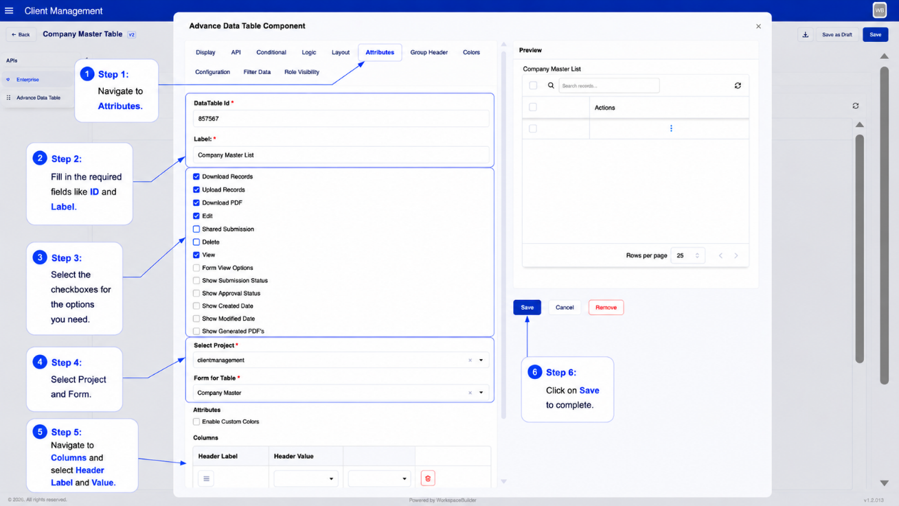
All settings for configuring the Advance Data Table are found under the component's Attribute tab.
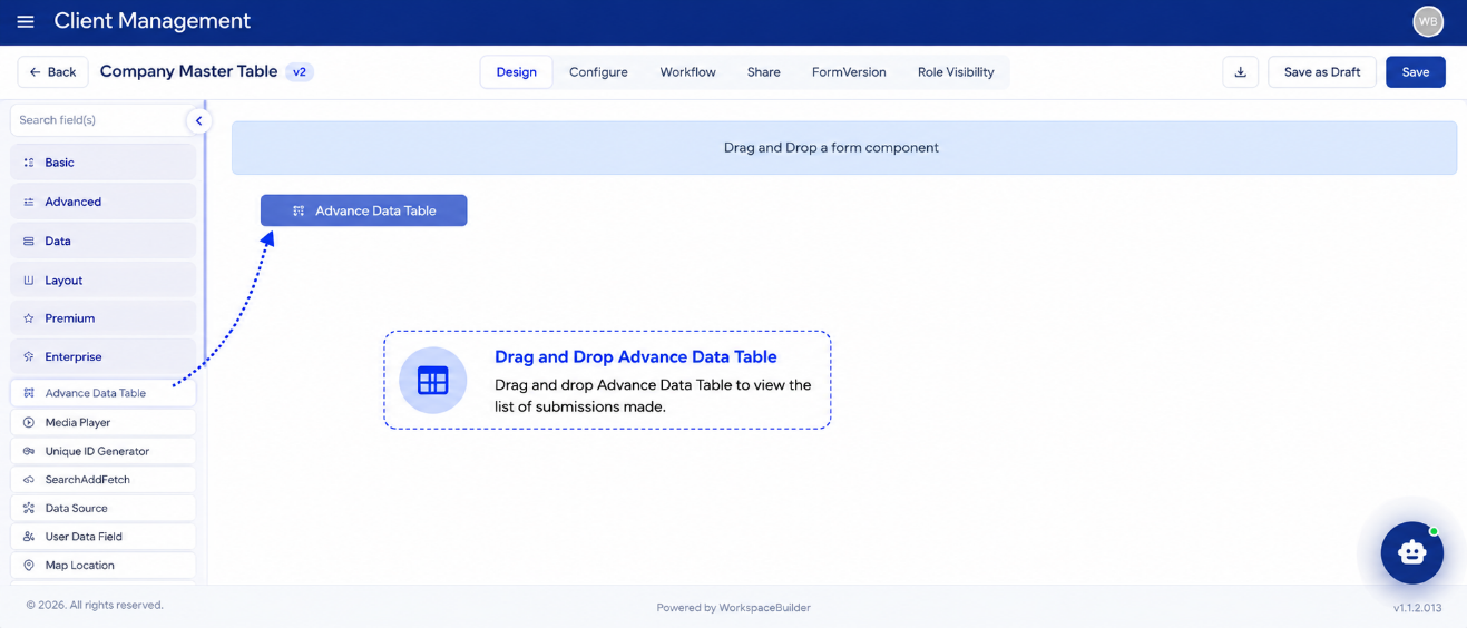
- Drag and drop the Advance Data Table component from the Custom group in the Form Builder.
- Navigate to the Attribute tab to configure all options.
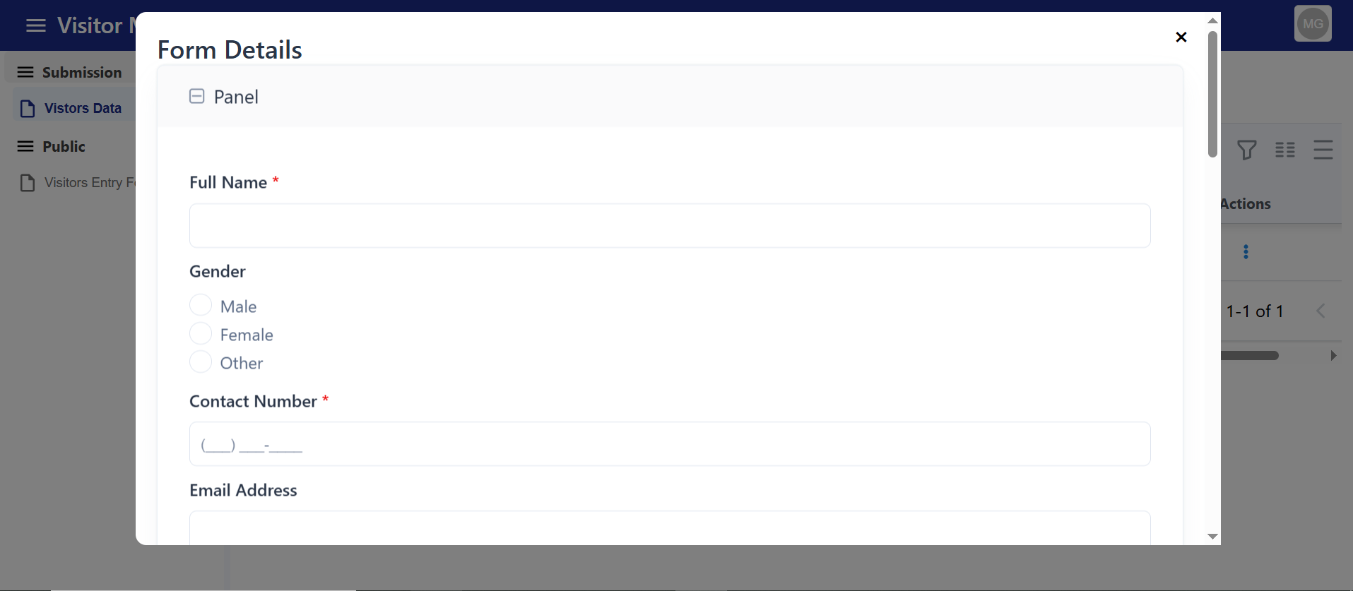
Label
Enter the label name for the table. This is displayed as a visible heading above the table in User Mode.
Form for Table
Choose the source form whose submission data will populate the table.
Example:
- Parent Form: "User Dashboard"
- Form for Table: "Employee Registration"
The table will list all employee registration submissions.
Attributes (Columns)
Define which fields from the selected form appear as columns in the table.
| Setting | Description |
|---|---|
| Header Label | The column title shown in the table header (e.g., "Full Name") |
| Header Value | The data key from the submission to display (e.g., fullName) |
| Add / Remove | Dynamically add or remove columns |
Column Group Headers
You can group multiple columns under a shared header label, creating a two-row header structure.
| Setting | Description |
|---|---|
| Group Label | The text displayed in the group header row |
| Columns in Group | Select which columns belong to this group |
Ungrouped columns appear in a flat single header row when no groups are configured.
Cell Color Styling
Apply background and text color to specific columns or specific cell values using two systems:
Per-Column Color
In the Attributes section for each column:
| Setting | Description |
|---|---|
| Background Color | Sets a badge-style background for all cells in that column |
| Text Color | Sets the text color for all cells in that column |
| Specific Text | Only applies color when the cell value exactly matches this text |
| Specific Text Background | Background color applied when specific text matches |
| Specific Text Color | Text color applied when specific text matches |
Column Color Rules
Define value-based conditional color rules independently of column definitions. Each rule targets a specific column key and a specific cell value, and applies a custom badge background and text color when matched.
Actions
Enable or disable row-level actions. Each enabled action appears in the row's three-dot menu (⋮):
| Action | Description |
|---|---|
| Edit | Opens a sidebar drawer with the full submission data for editing and updating |
| Delete | Instantly removes the selected record from the table and submissions |
| View PDF | Downloads or previews the submission's configured PDF |
| View Generated PDFs | Opens a modal listing all previously generated PDF files for a submission |
| View (custom) | Opens a configured form in a modal for new data entry or viewing |
View Configurations
You can configure multiple View actions, each opening a different form in a modal popup. For each view configuration:
| Setting | Description |
|---|---|
| View Label | The label shown in the three-dot menu for this view action |
| View Form | The form that opens inside the modal when the user clicks the action |
Download Options
| Option | Description |
|---|---|
| Export (Excel / CSV / PDF) | Enables the export toolbar button with options to export current page or selected rows in CSV, Excel (.xlsx), or PDF format |
| Import Excel | Enables an Excel upload button in the toolbar that allows bulk data import |
Note: PDF export generates a formatted report with page footers. PDF download per row (View PDF) requires Configure PDF Settings to be completed in the form builder.
System Columns
Enable optional system-level columns that appear alongside your defined columns:
| Toggle | Column Added | Description |
|---|---|---|
| Show Submission Status | Status | Displays a colored badge: green for Approved, red for Rejected, grey for default |
| Show Approval Status | Approval Status | Shows the latest approval step with a history trail; click the badge to open the Approval Timeline modal |
| Show Created Date | Created | Displays the record creation timestamp |
| Show Modified Date | Modified | Displays the last modification timestamp |
Static Filter
Always apply a fixed filter to every data fetch, regardless of user input.
| Setting | Description |
|---|---|
| Static Filter Column | The column key to filter on |
| Static Filter Value | The value to match |
| Static Filter Type | Filter comparison type (e.g., equals, contains) |
This is useful for scoping a table to a specific category, project, or status without exposing the filter to users.
User-Based Dynamic Filter
Automatically filter table rows based on the currently logged-in user's profile data.
| Setting | Description |
|---|---|
| Filter Field Label | The submission field key to filter on |
| User Detail Field | The field from the user's profile to use as the filter value |
| Unrestricted Roles | Roles that bypass the user filter and see all records |
When a user with a matching role logs in, only their own records appear in the table. Users with an unrestricted role see all records.
Add New Record
When enabled, an Add button appears in the toolbar. Clicking it opens the linked form in a sidebar for creating a new submission.
| Setting | Description |
|---|---|
| Enable Add | Shows or hides the Add button in the toolbar |
Auto Refresh
Configure the table to automatically reload data at a regular interval.
| Setting | Description |
|---|---|
| Auto Refresh (minutes) | Number of minutes between automatic data reloads. Leave empty or set to 0 to disable. |
A manual Refresh button (⟳) is always available in the toolbar regardless of auto-refresh settings.
Page Size Options
Configure the available rows-per-page options for the table's pagination control.
Default options: 10, 15, 25, 50, 100
Color Theme
Customize the visual appearance of the table:
| Setting | Description |
|---|---|
| Group Header Background | Background color of the group header row |
| Group Header Text Color | Text color of the group header row |
| Table Header Background | Background color of the column header row |
| Table Header Text Color | Text color of the column header row |
| Table Background Color | Background color of the table body |
| Table Text Color | Text color of the table body |
Text colors are auto-calculated for contrast when not explicitly set.
How to Use
- Add the Component
- In the Form Builder, drag and drop the Advance Data Table component from the Custom group.
-
Configure Table Source
- Go to the Attribute tab.
- Set Form for Table — this is the data source for submissions.
- Add Columns and assign header labels and data keys.
-
Enable Actions and Options
- Toggle Edit, Delete, View PDF, Export, and Import as needed.
- Configure View Configurations if multiple view modals are needed.
- Enable System Columns (Status, Approval Status, Created, Modified) if required.
-
Set Up Filters (optional)
- Add a Static Filter to scope data automatically.
- Configure User-Based Filter to show each user their own records.
-
Save and Test
- Save the form.
- Open it in User Mode to interact with the live Advance Data Table.
How It Works in User Mode
When users open a form containing the Advance Data Table, they see a fully interactive table populated with submission records from the configured source form.
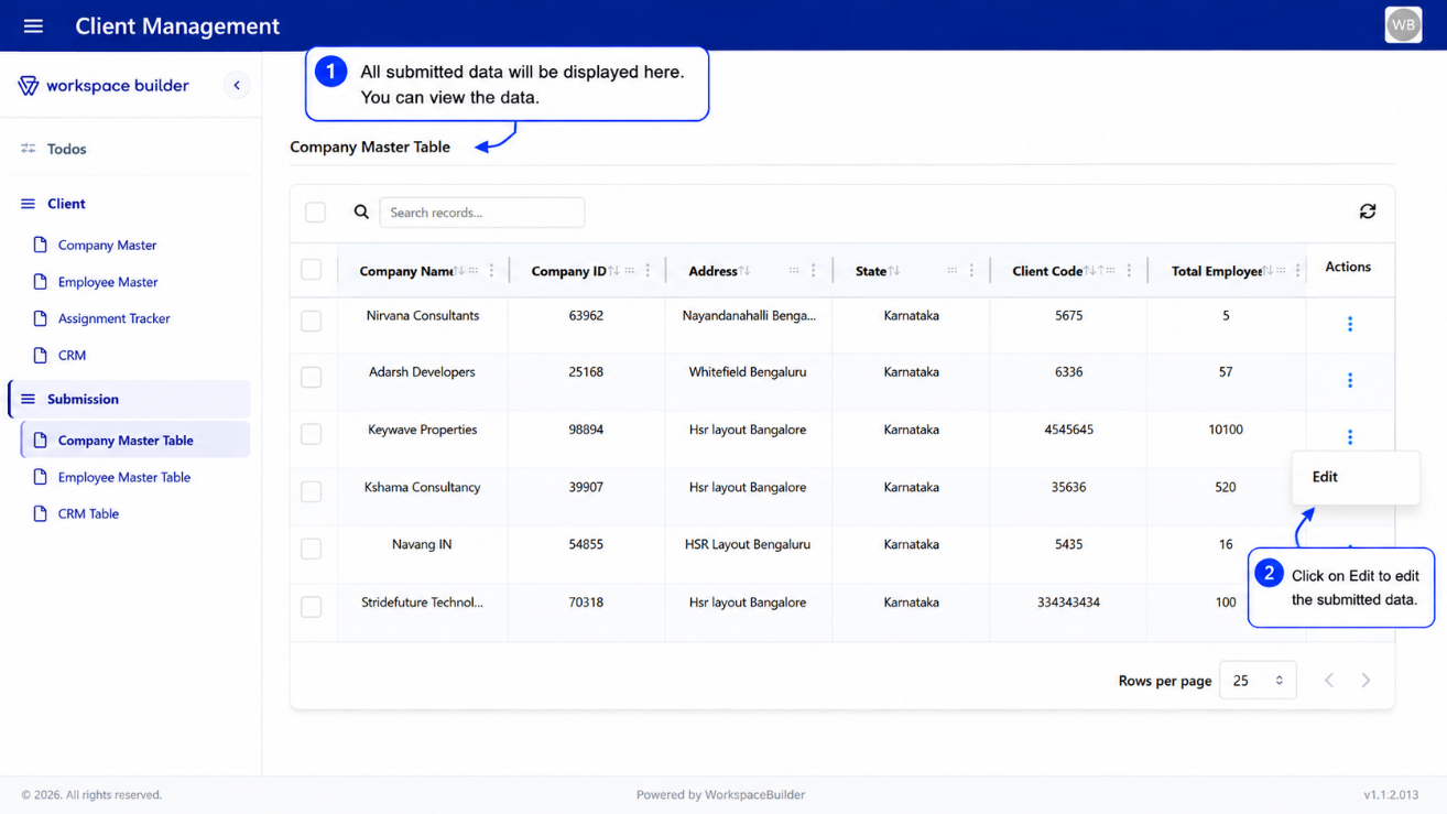
Toolbar
The toolbar is displayed at the top of the table and contains:
- Global Search – Type to search across all records. Results appear after a short debounce. A search chip shows the active search term and can be dismissed.
- Filter Chips – Active column filters appear as styled badges showing the column name, filter mode, and value. Click a chip to remove that filter.
- Add Button – Opens the linked form in a sidebar for creating a new record (when enabled).
- Clear All Filters – Appears when any filter is active. Resets all column filters, global search, and sorting.
- Export Button – Opens a dropdown to export the current page or selected rows as CSV, Excel, or PDF.
- Import Button – Opens a file input to upload an Excel file for bulk data import.
- Refresh Button – Manually reloads the table data from the server.
Column Features
Each column in the table supports the following:
| Feature | Description |
|---|---|
| Sorting | Click a column header to sort ascending or descending |
| Column Filter | Open a per-column filter input from the column's action menu |
| Filter Modes | Choose how to match: Fuzzy, Contains, Starts With, Ends With, Equals, Greater Than, Less Than, Between |
| Column Resizing | Drag the resize handle at the right edge of any column header |
| Column Reordering | Drag and drop columns to rearrange them |
| Column Pinning | Pin columns to the left or right via the column action menu |
| Column Visibility | Show or hide individual columns via the column action menu |
The Actions column is always pinned to the right edge of the table.
Row Selection
- Rows can be selected using the checkbox in the leftmost column.
- Select all rows on the current page using the checkbox in the toolbar.
- The number of selected rows is displayed in the toolbar.
- Selected rows can be exported using the Export → Export Selected option.
Alternating Rows
Rows alternate between white (#ffffff) and a light grey (#F8FAFC) for readability. Selected rows are highlighted in light indigo (#EEF2FF).
Cell Display
The table intelligently renders cell values based on their type:
| Data Type | How It Displays |
|---|---|
| Text / Number | Truncated to 20 characters; full value shown on hover |
| Date | Formatted as DD/MM/YYYY or DD/MM/YYYY HH:MM AM/PM if time is present |
| File / Attachment | View (eye icon) and Download buttons |
| Image (base64) | Rendered inline as a small image |
| Signature | View button that opens the signature image in a modal |
| Datagrid / Array | Expandable <details> element showing a mini table of rows |
| Object / DataMap | Inline key-value table |
| Nested Form Reference | "View Child Record" label with an eye icon that opens the child submission in a sidebar |
| Empty | Displays a dash (-) centered in the cell |
Pagination
The table uses server-side pagination. Navigation controls are displayed in the bottom toolbar:
- Previous / Next page buttons
- Page size selector (configurable options)
- The table fetches new data from the server on each page change
1. Edit Action
Clicking Edit in the three-dot menu opens a sidebar drawer displaying the full submission data for the selected record.
- Users can modify field values and submit to update the record.
- The table refreshes automatically after a successful update.
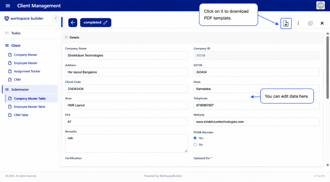
PDF Download in Edit Sidebar: If a PDF configuration is set up, the Edit sidebar includes a Download PDF button that generates and downloads the submission as a formatted PDF.
Status Management: The top of the Edit sidebar displays the current submission status (e.g., Submitted, Approved, Rejected).
Admins can manually update the status:
- Tick the "Update Status Manually" checkbox.
- Select the new status from the dropdown.
- Click Update to apply.
2. Delete Action
Clicking Delete in the three-dot menu removes the selected record from the table and from the form submissions.
A confirmation dialog is shown before deletion to prevent accidental data loss.
Note: Deleted submissions cannot be recovered unless versioning or backups are enabled.
3. View Action
Clicking a View action in the three-dot menu opens a modal popup displaying the configured form. The form opens inside the modal, allowing the user to enter and submit new data directly.
Multiple view actions can be configured, each opening a different form with a distinct label.
4. Approval Timeline
When the Approval Status column is enabled, clicking the approval badge in any row opens the Approval Timeline modal. This modal shows a chronological history of all approval steps, including:
- Status at each step (Approved, Rejected, Pending)
- Timestamp of the action
- Comments or notes from each approver
5. File and Signature Preview
- File attachments display View and Download icon buttons. Clicking View opens a full-screen preview modal for images or PDFs.
- Signatures display a View button that opens the signature image in a modal.
- PDF files open in a new browser tab.
6. Generated PDFs List
When View Generated PDFs is enabled, clicking this action in the three-dot menu opens a modal listing all PDF files associated with a submission. Each file can be previewed or downloaded individually.
Mobile / Card View
On small screens or inside compact sidebar contexts, the table automatically switches to a card-based layout. Each record is displayed as a card showing its key fields, with the same Edit, Delete, PDF, and View actions accessible per card.
Navigation between pages uses Previous / Next buttons in the card layout.
Custom ID Generator Component
The Custom ID Generator Component is used to automatically create unique identifiers for records, forms, or users. It ensures IDs follow a specific format (like prefixes, suffixes, or numbering sequences) to maintain consistency. This helps in avoiding duplication and makes tracking or referencing data much easier.
How to Use
Go to the Attribute tab.
The Attribute setting determines the type of ID your component will auto-generate.
ID Type
Select an option from the ID Type dropdown:
-
String → Generates IDs in text format (e.g.,
USER123,EMP001). Useful when IDs require prefixes, suffixes, or meaningful labels. -
Integer → Generates sequential numeric IDs (e.g.,
1,2,3…). Ideal for simple counters like invoice numbers, order numbers, or ticket IDs. -
UUID → Generates universally unique identifiers (e.g.,
550e8400-e29b-41d4-a716-446655440000). Best for ensuring global uniqueness across databases or distributed systems.
Length
Length controls the fixed size of the generated ID, ensuring all IDs are consistent in format.
SearchAddFetch
The Search • Add • Fetch component extends your Custom Component with powerful dynamic data capabilities. It allows users to search existing records, add new entries, and fetch related data — all within a single interactive interface.
This component is perfect for scenarios like selecting customers, products, or users from an API, and auto-filling related fields in your form.
The Search • Add • Fetch feature creates a small interactive data block inside your form. It supports three core actions:
- Search: Query or filter data from an external or internal API and display results in a dropdown or list.
- Add: Open a modal form to create and submit a new record (POST request to your API).
- Fetch: Once a record is selected, automatically retrieve and populate additional related data into other form fields.
Together, these functions provide a mini-CRUD experience within a single form — combining HTML layout and JavaScript logic for data handling, refreshing, and syncing with other form components.
Steps to Configure
-
Add the Component Drag and drop the Search • Add • Fetch component into your form.
-
Set the Label and Button Name Give the component a clear label (e.g., "Customer Search"). Enter the desired Add button text (e.g., "Add New Customer").
-
Configure the Data Source Provide the Data Binding URL to fetch existing records from an API.
-
Define Display Field Choose which field (e.g., name, title, or ID) should appear in the search dropdown.
-
Set Up Field Mappings Use Autofill Field Mapping to link data fields from the selected record to form components.
-
Save and Test Save your form and open it in User Mode to test searching, adding, and auto-filling functionality.